Have you ever wondered how to paint reflections in water? I have always been fascinated by this topic, and I decided to challenge myself with a project that would capture the beauty and complexity of light and water. In this blog post, I will share with you my process and inspiration for creating “Blue Moon”, a painting of a city skyline at night, with a stunning glow-in-the-dark effect.
The Inspiration
The idea for this painting came to me when I was thinking about what kind of scene would be interesting and challenging to paint with reflections. My thoughts went immediately to a city skyline, with its tall buildings, bright lights, and busy streets. I wanted to create a contrast between the dark and the light, the natural and the artificial, the calm and the chaotic.
I didn’t use any reference photos for this painting, but I looked at various photos for inspiration, and I had a rough idea of what I wanted to paint in my head. I also added elements from my imagination, such as a bridge and a Ferris wheel. I thought these elements would add some interest and variety to the scene, as well as some reflections of their own.
The Process
To start the painting, I jumped in painting right away, without sketching with a pencil first. I painted the background with acrylic paints, using a dark blue for the sky and a lighter blue for the water. I also painted the moon with white paint, leaving some space around it for some light at the rim of otherwise invisible clouds.
Next, I painted the buildings with black paint, using a wide brush to create the shapes. The buildings were too far away to see any details, they were just dark, almost black shapes with lights from windows breaking the monotony. I also painted some red lights on top of two skyscrapers that are connected by a roof, forming a bridge. I thought this would create a focal point and a contrast in the painting.
Then, I painted the Ferris wheel with yellow and red paint, using a small brush to create the lights and spokes. I also painted some yellow streetlights along the water, illuminating the green trees. I wanted to create some warmth and cosiness in the scene, as well as some reflections in the water.
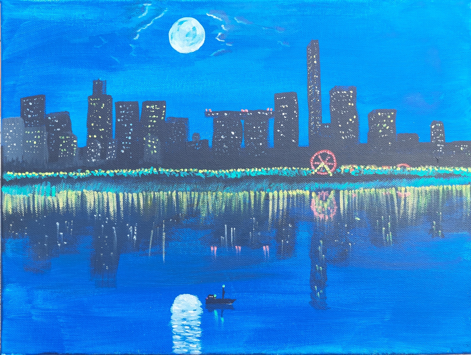
Finally, I added some glow-in-the-dark paint to the painting, using a fine brush. I applied this paint on top of the white moon, creating a halo effect. The glow-in-the-dark paint used on the moon is blue, hence the title of the painting. I also applied it on some of the windows of the buildings, especially those near the water. I also added some dots of glow-in-the-dark paint on the water, creating some sparkles and ripples. I wanted to create some magic and mystery in the scene, as well as some contrast between day and night.
The Result
The painting was finished after several hours of work, and I was very happy with how it turned out. It looked like a painterly and beautiful city skyline at night, with reflections in the water that captured my attention and imagination.

But the best part was when I turned off the lights and saw how the painting transformed in darkness. The moon glowed brightly in blue, creating a stunning reflection in the water. The windows of the buildings also glowed in different colours, creating some patterns and shapes in the dark. The Ferris wheel also glowed in red, creating a circle of light in the water as well as on land. The painting looked like a different world, full of wonder and mystery.