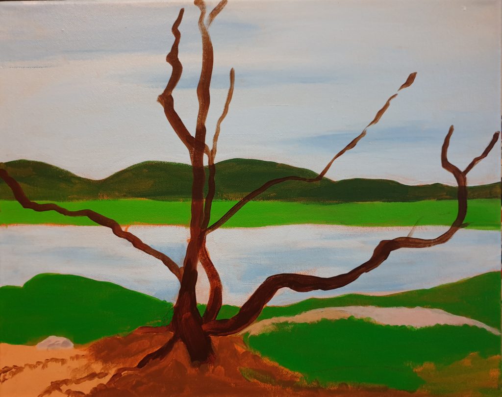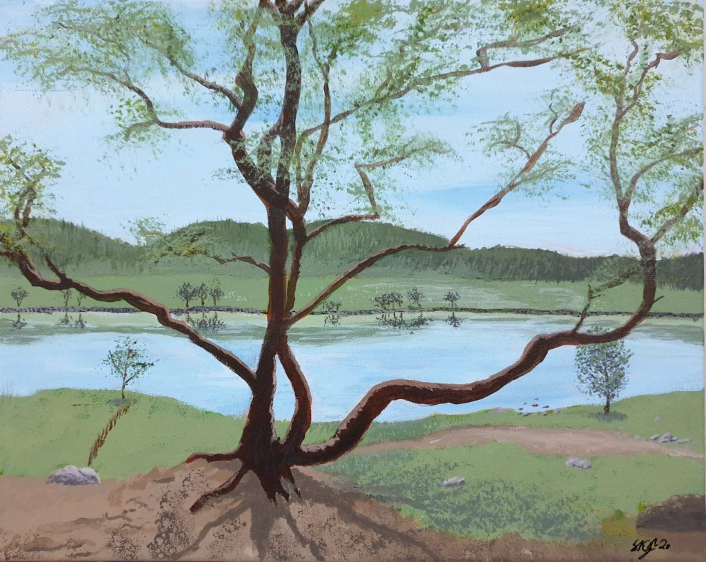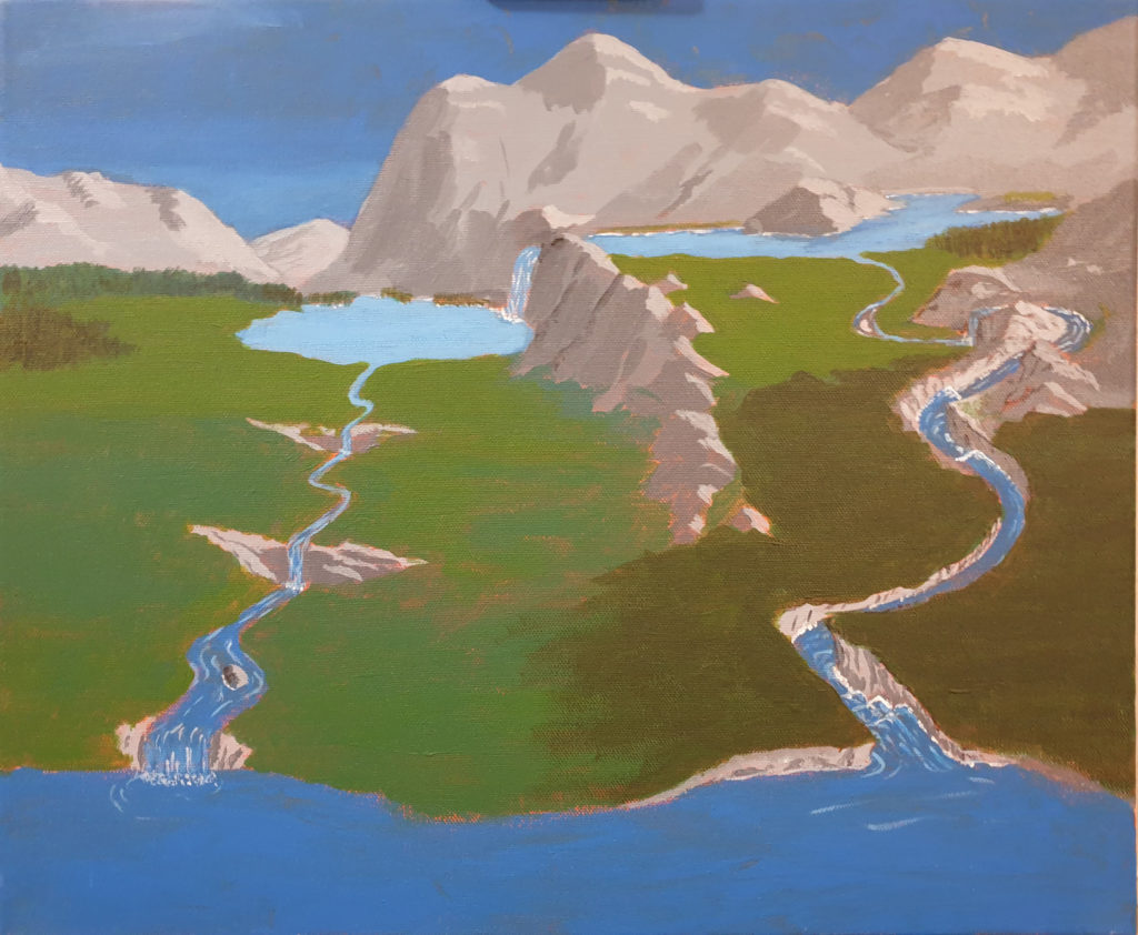
It’s been some time since I started this painting – and some time since I finished it. I just haven’t managed to update this blog with it. Which, of course, is a shame. So now I’m going to rectify this!
When I was thinking of a painting, I knew that I wanted water and that the rocks on the bottom should be visible. And a somewhat interesting scene. I’m pretty sure there are some very nice pictures around that fulfil this, but I searched for a while to find some – without luck. My own taste probably has to take some of the blame, but still …
In the end, I made use of AI to make some suggestions, which I in turn used for some inspiration. I have no qualms about using AI that way. Sometimes having something to look at for painting is better than painting directly from imagination.
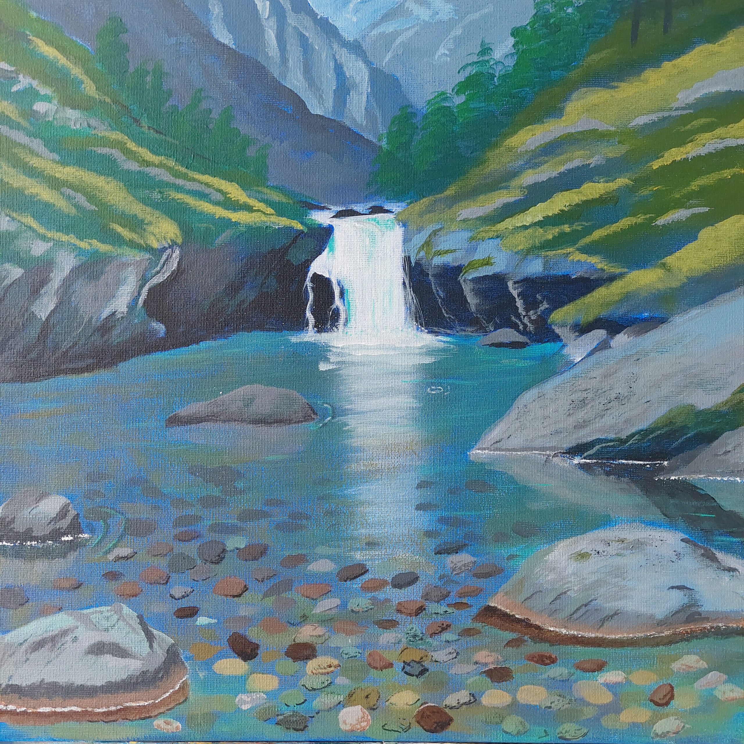
As you see from the painting I show above here, I wanted a little waterfall, too. And the nature hat to fit, of course. So, I had all I wanted: Water, a waterfall, and rocks underwater.
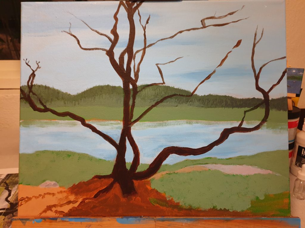
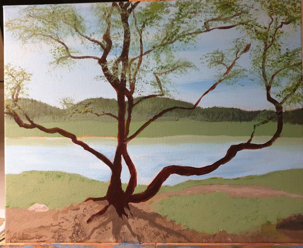
Sketching the broad objects went quickly. Some of the details, too. Or the illusion of details. And then it stopped up for various reasons. But in the end I managed to add the rocks under the water, various degrees of details, and … when I asked the art teacher, she said that yes, now it’s finished.
Personally, I wasn’t sure if it was finished, so I waited a long time before I did ask. I wasn’t sure, because there’s always more that can be done, but I’m not going for photorealism, just a simplified painting, so at some point I have to stop.
And this was the point where I stopped! 😀