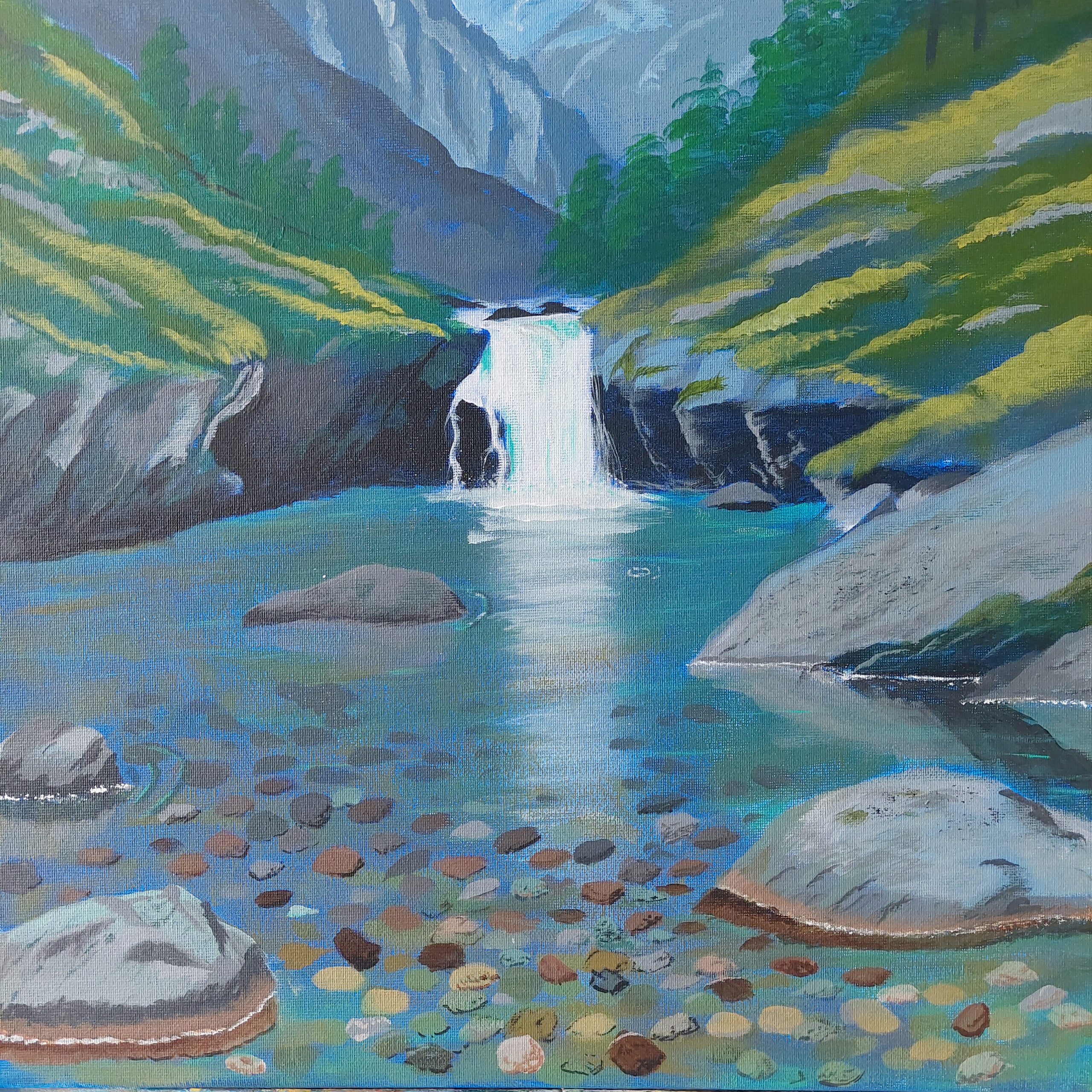
It’s been some time since I started this painting – and some time since I finished it. I just haven’t managed to update this blog with it. Which, of course, is a shame. So now I’m going to rectify this!
When I was thinking of a painting, I knew that I wanted water and that the rocks on the bottom should be visible. And a somewhat interesting scene. I’m pretty sure there are some very nice pictures around that fulfil this, but I searched for a while to find some – without luck. My own taste probably has to take some of the blame, but still …
In the end, I made use of AI to make some suggestions, which I in turn used for some inspiration. I have no qualms about using AI that way. Sometimes having something to look at for painting is better than painting directly from imagination.
A calming nature scene
As you see from the painting I show above here, I wanted a little waterfall, too. And the nature hat to fit, of course. So, I had all I wanted: Water, a waterfall, and rocks underwater.
Sketching the broad objects went quickly. Some of the details, too. Or the illusion of details. And then it stopped up for various reasons. But in the end I managed to add the rocks under the water, various degrees of details, and … when I asked the art teacher, she said that yes, now it’s finished.
Personally, I wasn’t sure if it was finished, so I waited a long time before I did ask. I wasn’t sure, because there’s always more that can be done, but I’m not going for photorealism, just a simplified painting, so at some point I have to stop.
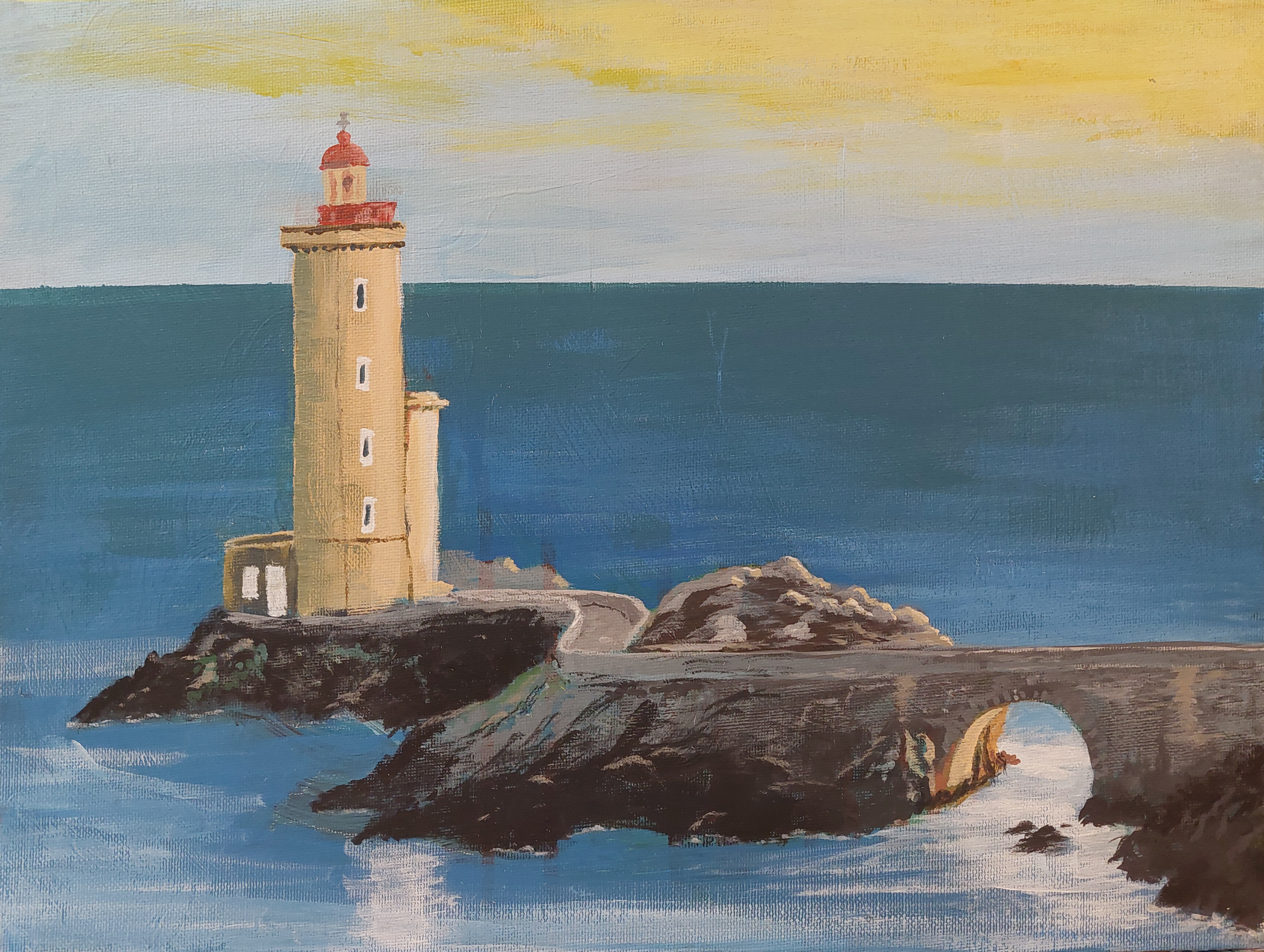
It’s been an exciting start to the painting class this year, and I couldn’t resist the urge to embark on a personal artistic journey during our first session. While our teacher is always a valuable resource for guidance and does suggest themes to paint, I felt compelled to follow my own muse this time around.
My inspiration? A picturesque scene featuring a solitary lighthouse perched at the edge of a series of interconnected islets, linked by a quaint road and bridge. With a photo providing the needed inspiration, I dove into the world of acrylics, eager to bring this vision to life on canvas.
The initial stages of the painting involved blocking in the main colours, defining the vast expanse of the sky, the tranquil waters of the sea, and the main shapes of the islets and bridges. And the lighthouse, of course. However, as any artist knows, the creative process is never without its challenges. Sometimes a little break is needed to see the work in process from a little distance, both physically and time-wise.
Towards the lighthouse
Upon revisiting the painting after a brief hiatus, I realized the importance of refining the composition. The horizon demanded a straighter, more horizontal alignment, while the hues of the sea and the light in the sky needed to be subtly muted to evoke a sense of serene tranquillity. The rough outlines of the islets needed to be better defined, and I got some details in to make it easier to see the real shapes and figure out the placement of the lighthouse and bridge.
Ah, but the true heart of the painting emerged with the depiction of the lighthouse itself. Time was spent meticulously crafting its structure, ensuring that every colour and detail resonated authentically with the scene I envisioned. Or at least, making it look good. While not an exact replica of my reference, I aimed to capture the essence and spirit of this wonderful beacon.
With the lighthouse taking the main stage, attention turned to enhancing the surrounding landscape. Additional details were painstakingly added to the islets, bridges, and roads, imbuing them with a sense of rustic charm and character.
In the end, the road led the eyes from the bridge towards the lighthouse, where it rose towards the sky.
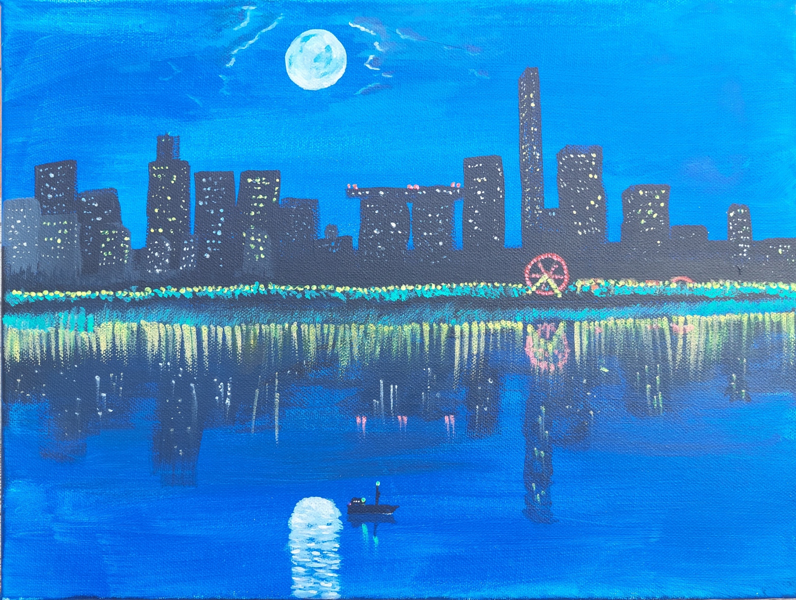
Have you ever wondered how to paint reflections in water? I have always been fascinated by this topic, and I decided to challenge myself with a project that would capture the beauty and complexity of light and water. In this blog post, I will share with you my process and inspiration for creating “Blue Moon”, a painting of a city skyline at night, with a stunning glow-in-the-dark effect.
The Inspiration
The idea for this painting came to me when I was thinking about what kind of scene would be interesting and challenging to paint with reflections. My thoughts went immediately to a city skyline, with its tall buildings, bright lights, and busy streets. I wanted to create a contrast between the dark and the light, the natural and the artificial, the calm and the chaotic.
I didn’t use any reference photos for this painting, but I looked at various photos for inspiration, and I had a rough idea of what I wanted to paint in my head. I also added elements from my imagination, such as a bridge and a Ferris wheel. I thought these elements would add some interest and variety to the scene, as well as some reflections of their own.
The Process
To start the painting, I jumped in painting right away, without sketching with a pencil first. I painted the background with acrylic paints, using a dark blue for the sky and a lighter blue for the water. I also painted the moon with white paint, leaving some space around it for some light at the rim of otherwise invisible clouds.
Next, I painted the buildings with black paint, using a wide brush to create the shapes. The buildings were too far away to see any details, they were just dark, almost black shapes with lights from windows breaking the monotony. I also painted some red lights on top of two skyscrapers that are connected by a roof, forming a bridge. I thought this would create a focal point and a contrast in the painting.
Then, I painted the Ferris wheel with yellow and red paint, using a small brush to create the lights and spokes. I also painted some yellow streetlights along the water, illuminating the green trees. I wanted to create some warmth and cosiness in the scene, as well as some reflections in the water.
The skyline in daylight
Finally, I added some glow-in-the-dark paint to the painting, using a fine brush. I applied this paint on top of the white moon, creating a halo effect. The glow-in-the-dark paint used on the moon is blue, hence the title of the painting. I also applied it on some of the windows of the buildings, especially those near the water. I also added some dots of glow-in-the-dark paint on the water, creating some sparkles and ripples. I wanted to create some magic and mystery in the scene, as well as some contrast between day and night.
The Result
The painting was finished after several hours of work, and I was very happy with how it turned out. It looked like a painterly and beautiful city skyline at night, with reflections in the water that captured my attention and imagination.
The skyline at night
But the best part was when I turned off the lights and saw how the painting transformed in darkness. The moon glowed brightly in blue, creating a stunning reflection in the water. The windows of the buildings also glowed in different colours, creating some patterns and shapes in the dark. The Ferris wheel also glowed in red, creating a circle of light in the water as well as on land. The painting looked like a different world, full of wonder and mystery.
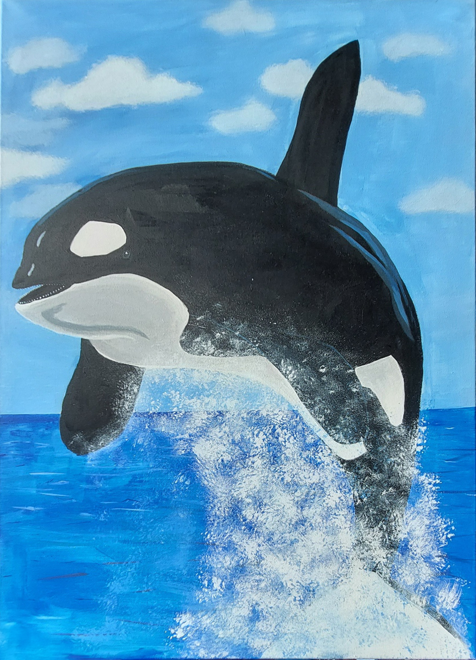
Free Willy! That was the comment when I said I wanted to paint an orca. I pondered the iconic movie poster as an inspiration but settled for focusing on the orca. Or an orca, as it’s not exactly “Willy” himself.
This was a continuation of the watery challenge mentioned in an earlier post. Still, instead of staying underwater, I went with a creature that stays primarily submerged in water, breaking the surface to breathe, or to have fun. And as I revealed already in the first paragraph, the creature is an orca.
It’s my largest finished painting so far, 65×90 cm
And I really wanted to challenge myself, by using the largest canvas I have. Well, an orca may not be the most difficult subject to paint being black and white, but then again shadows and highlights are essential not to make it look flat.
Blocking in the colours was quick, but then there were the details. While this isn’t a realistic style painting, adding details to the painting still takes time, at least for me. I’m sure it’ll get easier and faster with experience.
When I look at it now, I see all the things I could do differently or better, but I still got nice responses from people who like it. This just goes to show yet again: There’s no one more critical of my work than myself. Maybe this was what Leonardo da Vinci had in mind when he said “A painting is never finished, only abandoned.”
During my time as a happy amateur painter, I’ve painted motives from over the water, most of them not including water at all. So, wasn’t it time for a little change, and to get a completely different perspective? Like, painting a motive from under the water’s surface? I thought so.
I had long wanted to paint something like a castle ruin underwater as if the land had sunken or the sea had risen. That would be a detailed painting. Maybe too complex for the time I had for this challenge, at least the digital versions I had been somewhat creative with.
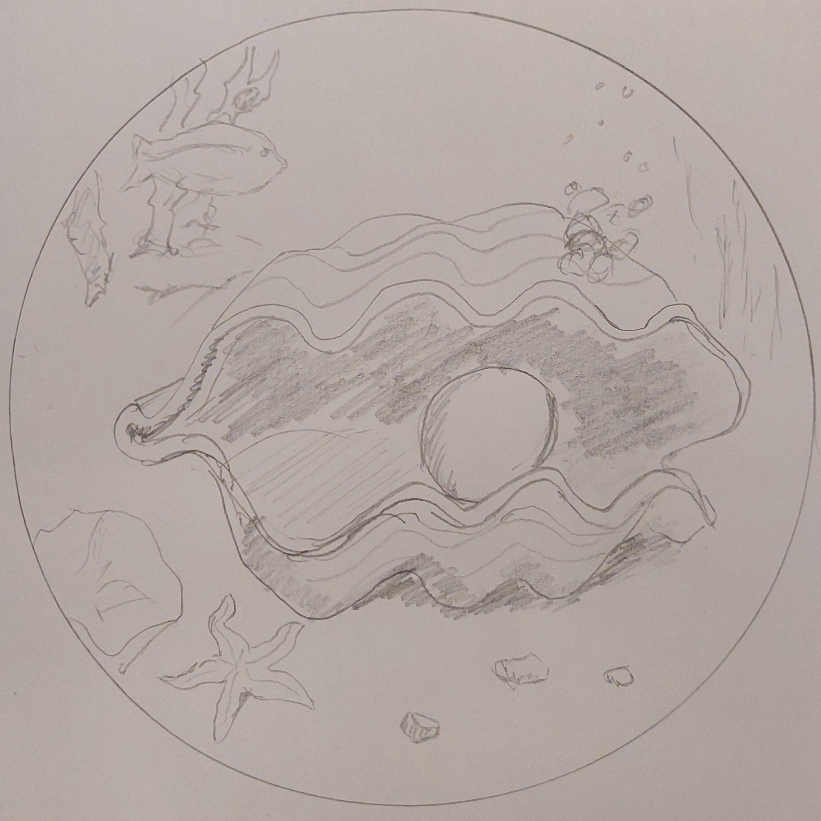
While pondering about this, I also figured I wanted to try painting on a circular canvas. I mean, I had bought a couple, so I had to use them, right? Which also would put some limitations on the motive.
I had an idea. But would it work?
I made a quick sketch in a circle.
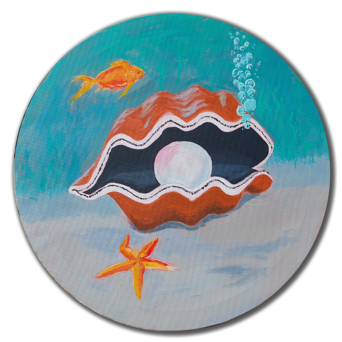
I opened my trusty ol… brand-new sketchbook and tested my idea. Yup, it seemed to work for me. A giant pearl in a mussel looked just right. So the next step was to paint it. And paint it I did!
A bit different from the sketch, but I think it works.
I removed some of the objects; some I didn’t paint at all, and some I painted over afterwards because they didn’t really fit in – they removed the focus from the pearl. We can’t have that! But there’s enough variation for the whole image to work.
I’m SO ready for warmer weather now. This is a small-ish acrylic painting I did some weeks ago when the weather was even colder. That was OK then – it was that time of the year. It was the colours and sunset that inspired me to do this, I love the warmth of it.
Dreaming of a tropical beach
Of course, it doesn’t hurt to dream of some time in a more tropical environment when the winter cold is ruling the outdoors.
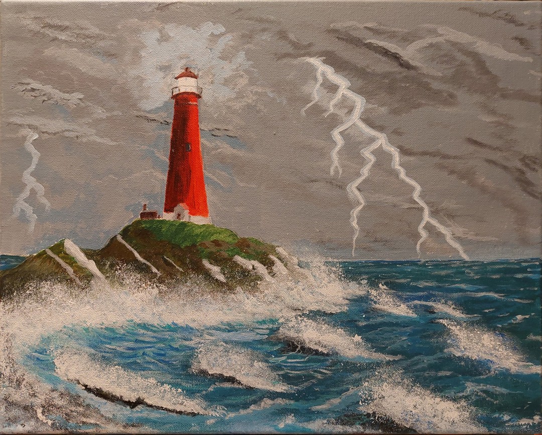
I wanted to paint a lighthouse in stormy weather, and with the help of AI I made some images that I used for inspiration
It’s been way too long since I’ve updated this blog now. Shame on me. Admittedly, I did post my lighthouse painting on Instagram, but I never got as far as writing about it here. So, time to do something about that.
A lighthouse in stormy weather
I painted this between Christmas and New Year, and was joined by mother who got inspired and wanted to paint a specific lighthouse on the Norwegian coast. One known as the most beautiful lighthouse in Norway. For me, it started with an idea: I wanted to paint a lighthouse, and I wanted it to be in stormy weather.
To achieve that I needed some reference pictures, but instead of searching for photos that I could use, I used one of the AI art generators to give me suggestions. A few tries and I got a few results that inspired me.
I mixed the ideas as I painted on the canvas; the sky from one image, the lighthouse and environment from another, and the waves varied a bit. The resulting picture is different from all of them, but I got the inspiration I wanted, and since the motive is imaginary in any case, I could easily take my artistic liberties and not make the lighthouse exactly as the picture. Although it mostly is. ????
There are still things I should practise, just to be able to paint better. There’s always something new to learn. Still, while I see the things I could do better, I’m still happy with what I made.
I haven’t forgotten about the traditional, analogue painting in favour of the digital versions, and I have no plans of giving it up. This summer I used acrylics again and painted some cascading waters. Was I finished, or did I need to do more?
I decided that I did not want to do more with it. Does that mean I’m finished with it? Well, let me quote a painter with more experience than me:
A painting is never finished, it is only abandoned
Leonardo da Vinci
Good enough answer?
Cascading waters
Motive is inspired by (i.e. not identical to) a photo I took home on the island where I grew up. It shows that even a little stream can be a nice motive to paint. The motives don’t have to be limited to bigger, amazing views!
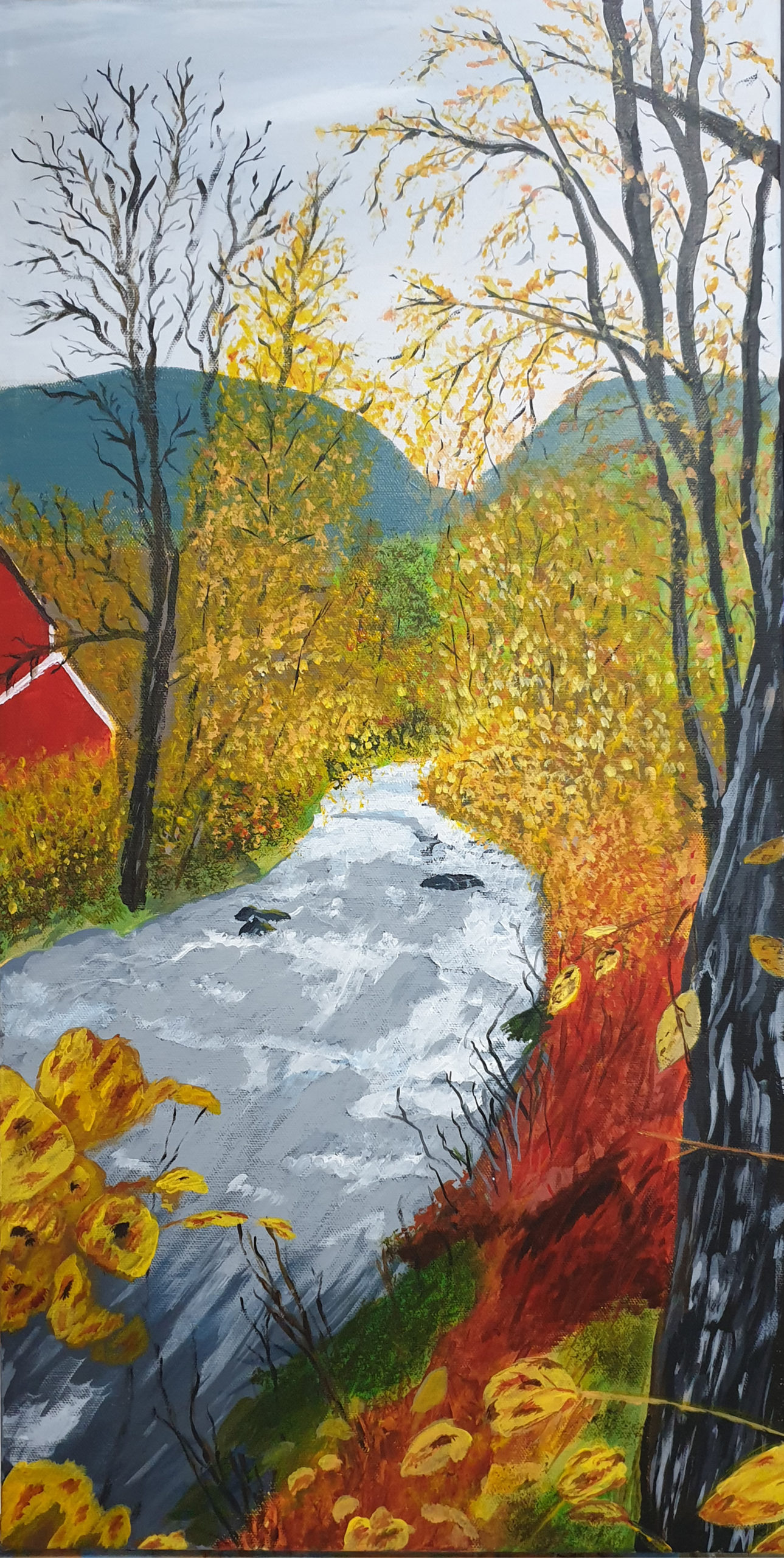
A friend of mine took a picture and posted on Facebook – and I instantly fell in love with it and wanted to paint it. Luckily she didn’t mind that, and even more luckily I found a canvas that suited the format perfectly: A tall picture, cell phone format 😉
At 35×70 cm, it’s the largest canvas I had painted on. Funnily enough, it’s also the painting that took shape the quickest for me. Almost like I’m starting to get some experience. Hmmm, could that be so?
Anyway, it’s a nice autumn picture, with the lovely autumn colours.
Motive from Volda
How could I not want to paint this? Sure, it’s a bit more simplistic than the photo I used as a reference, and there are always things I can get better at, but I’m learning! Most importantly though, I’m very happy with this. This is showing my abilities at present, and my current style of painting.
Seeing how I develop, both in knowledge, abilities and style is part of the fun, to be enjoyed in the time that comes. 🙂
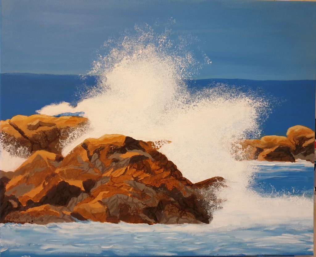
It’s time to paint again – and to finish the painting. And today I’ve done both. Judging from the ime I used, around five hours total actively painting, I think I do get somewhat better at it. I probably spent more time figuring out what to paint.
And, what did I decide to paint? The title of this post gives a hint, but you’ve probably already seen the painting below.
reaking waves
Quite a watery picture, with the splashing waves. Personally, I’m happy with the result. Just need to add my signature.