Optical Illusions

I guess we all have seen various optical illusions; drawings that can be seen as two different things at the same time, images where the shapes also seem to hide or form other figures, geometrical constructs where the angles seem to be OK, but at the same time are completely impossible.

M.C.Escer: Waterfall
Waterfall by M.C.Escher

One well-known artist of the impossible geometry is the Dutch Maurits Cornelis Escher. Way more can be said of him and his art than I will do, other than that he serves as the inspiration for one of my paintings in progress.

The image I’m thinking of is “Waterfall” – impossible geometry where the water flows down in an aqueduct all the way, and ends up in a water all down into the beginning of the same aqueduct. All the action takes place in a limited space, and it’s easy to see how it’s done. But in my mind, I was playing with the idea of taking the same principle and transfer it into nature, making a believable picture, despite the water flowing downwards all the time, in a circuit with several waterfalls. Would it be possible?

I had a rough idea, sketched it on paper, just as rough, and decided that yes, it would be possible. Then I had to decide if I should make a more detailed sketch, using photos and stitch together something in Photoshop, or just start painting, with that rough sketch as my starting point. I went for the latter option, as the rest would have me spend way too long time before I could start painting at all.

It started out nice and quick. I blocked in the colours for the first shapes; sky, mountains, water, ground. Added some more details after I decided where the light should come from. Made the river flow from the lake in the distance towards a lake in the foreground, with some waterfalls on the way to make it obvious. Then the time came for me to make the river flow back, down from the current low point to the starting high point …

OK. It’s easy enough to make the river flow downwards, but it should also look natural. I spent some time thinking of this. It started getting hard …

Work in progress of my "impossible nature painting"
Work in progress. I’m getting there, but lots of work left.

As it is still a work in progress, I’m not finished. By far.I’ve blocked in the main colours, so I see the shapes and things are getting clearer. There’s still a lot of details that need to be painted though, but there is one thing that’s getting very clear to me: I was overly optimistic about the time I would use on it. There’s more thinking to do than expected, to make it look convincing. So much that it has been hard to sit down and do some actual painting. There are other pictures I want to try, too, so maybe I’ll just start that before I finish this one. Luckily, that’s very much allowed. Getting my spirits high on painting something that doesn’t require this much thought can only be of the positive, and it’ll make it easier to start on this one again. I hope.

Sounds like I’m trying to convince myself here, but in any case, I’ll have to get some painting done again, and show it.

Oh, the possibilities

Painting with acrylics doesn’t have to be on canvas or paper only, it can be used for a lot of projects. I’ve mentioned models earlier, pre-made or homemade sculpts in clay, but of course, there’s 3D-printed stuff, objects made of wood, fabric, smartphone covers … Quite a lot, really.

Of course, some surfaces needs to be prepared in some way; they might be sanded, or primed. A wooden plate, or object, might be primed with gesso, to make it easier to paint, and using less paint in the process.

There are also different acrylic mediums, to be used with different materials. A fabric medium is perfect if you want to paint on your clothes, for example; it makes the paint easier to work with, and the clothes won’t be stiff like they might be if painted without the medium.

But there are mediums that are useful on your canvas (or other preferred painting surface) too. I got a little selection myself …

Various acrylic mediums, for future enjoyment

I was looking for some clear gesso, to prime a little wooden chest that I want to paint, in the style of an old treasure chest. I found it, but there were also a few others that caught my interest: What about a glow-in-the-dark medium? Cool! An image from computer games came to mind: A dark cave, with glittering, illuminating gems … Can be fun to see it in the dark.

A pearl medium? I’m sure that can be fun to try, too. And what about a shimmering/iridescent medium? Oh yes. I’m sure that cave with the gems can have a nice treasure, too, with shimmering valuables …

My mind is toying with the idea, and is a lot further on the path than my painting. I still have a special nature-motive I’m working on. But I’ll get there, it will all be used!

The Watermill

As you know, if you’ve read previous posts, I paint. I’m not a fast painter, but I paint. Hopefully, with practice I will get enough experience to be able to paint both faster and more often. And of course, better. That usually follows practice. 😉

Anyway, I’ve finished another painting now. Unless I at some point have a close look at it and decide to do more with it – but as for now, it’s finished: The watermill.

The watermill

Buy a daylight bulb

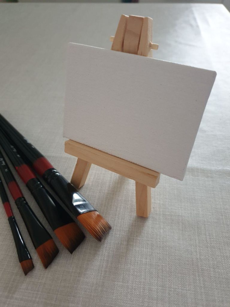
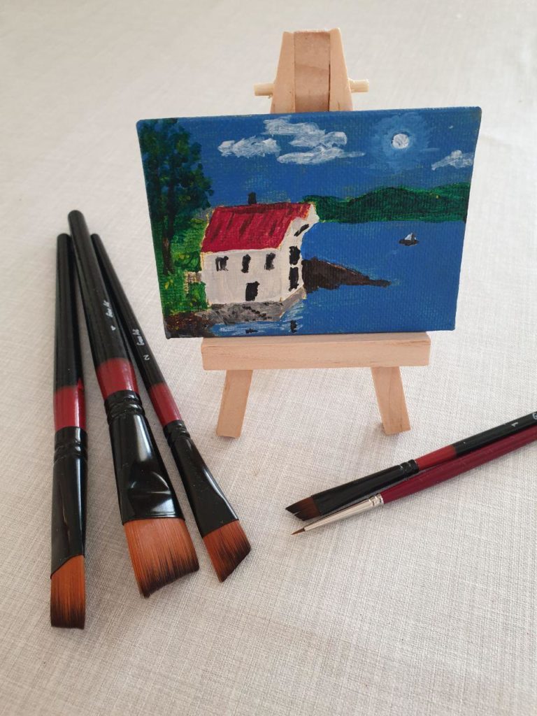
That’s what he said, our art teacher in class. Or at least strongly suggested it. There is a good reason for this, of course. Staying inside while painting isn’t particularly unusual, and it comes a no surprise that the sunlight is different from the artificial light indoors. The normal light bulbs emit a yellowish light, while the sun – the daylight – doesn’t.

So what – is it that dangerous? Why does it matter? Well, the reason is easy: Colours!

We want to have the correct colours for our motives when we paint – and the colours we see are the colours of the light reflected. When we mix our colours to paint with, we want them to be correct and represent what we actually see. This is where the artificial light can cause a problem; a yellow-tinted light is what we’re used to inside, but it will also fool us. When we mix colours, we will compensate for that yellow tint, which appears to be mixed in with the rest of the colours.

The result might look fine until we see the painting in daylight. Then the colours will be obviously wrong, and the painting doesn’t look good. Not fun.

Won’t the problem be the same, just opposite, if you paint in daylight, and then see the finished painting in the light from normal light bulbs? Nope. The light from the sun isn’t tinted with any colour, and thus there’s no colour to compensate for. And of course, that again means the colours are the correct ones, even when inside.

Sure, a tinted light inside will still affect the colours we see, but we’re used to it, and our eyes automatically adjust for it without we really noticing it. To compare what we actually see, we can use a camera. Cameras are quite stupid – we have to tell them what kind of light it is, be it outside in the sunshine, or overcast, or inside with normal light bulbs, and some other options. Then we can, for example, in a room with normal light bulbs tell the camera that it’s outside in the sunshine, and take a picture. Then we tell the camera that the light source is light bulbs, and take another picture of the same motive. The camera should then adjust its settings to compensate for the tinted light. Then we can compare the two pictures and see the differences in colour.

So, what did I do? I found what I needed, of course. It’s not just a daylight bulb, I can change both the intensity and temperature, so it can simulate sunshine, overcast, evening, plus of course the normal warm light bulb colour. And I can control it from the phone.

Quite smart.

And I could immediately see the difference by switching between daylight mode and normal mode. And it was quite a difference, too. It will be nice to paint “in the sunshine” rather than that warm light after this. 😉

Working with models

It’s not uncommon for painters to paint after live models, be it people or still life. As expected, this isn’t quite the same as painting after a photo; in the latter, you have the option to divide the photo up in lesser squares to make it easier to place correctly on the canvas. This is of course rather difficult with a live motive.

However, there is, of course, another way to paint a model. Yes, I know bodypaint is an option, but that’s not what I’m thinking of now. I’m thinking of something more complicated. A way where you really have to work with your models before even thinking about painting them.

It’s when you first make the models. From the ground up. and then paint them. Well OK, I know you can buy finished models, too, to paint, but this time it’s about the modelling act. Making models out of clay.

Years ago – or decades ago really – I bought some air drying clay. I never got any further with it than repairing the toe of a chicken-figure, but I kept the clay, airtight so it stayed soft. This was what I was looking for when I found the Folk Art acrylic paint mentioned in an earlier post. But why would I look for this? Am I tired of painting, wanting to sculpt instead? Nope. Not at all.

However, I got curious again, after having watched several videos by Ace Of Clay on YouTube: Where is that clay of mine? Do I still have it? Honestly, I don’t know. It might hide somewhere, or it might’ve been thrown away. No matter what, it doesn’t matter.

This isn’t because I lost interest in the topic, far from it. It’s still fascinating to see the figures made, and also dioramas, houses and more, be it from air drying clay or baking clay. And while I won’t give up painting, I have made some purchases …

Air drying clay, polymer clay, copper wire, and tools. I’ve got it!

The first purchase was the DAS air drying clay. An impulse-buy after I saw it in the shop. Then I needed some tools, of course, so I ordered the first set. This was a toolset to cut and mark the clay – but I noticed that pressing cavities in the clay was occurring often – so another set of tools were ordered.

Also, was air drying clay the best for making figurines? Maybe not… But at this point, I had already bought a package of baking clay. Professional, even, which should be extra good for that kind of work. I also bought some copper wire that can be used for armature and a roll of aluminium foil. This can be shaped roughly into the form of the figurines – the models – so that I don’t use as much of the expensive clay. I only need to use a thin layer.

Do I need more now, to start modelling? Probably not, not equipment, at least. Even if a pasta maker seems to be a favourite tool, as it makes it easier to knead and work with the clay. But what I need most, is the time to sit down with it. Currently, I prioritize the painting on canvas. I’m still learning there, and need to spend time on it to become more confident and faster.

A modelling career will have to wait a bit longer – but this time I don’t intend to forget it for decades 😉

What’s up?

Almost two months. That’s how long it’s been since I painted with my mom, but what have I done after that? Anything at all? Apart from acquiring the acrylic markers, I’ve been so silent …

It’s true, I feel like I haven’t done much at all, at least not painting. January was full up with other things on my mind, and I didn’t manage to do much at all of what I love to do, be it painting or other things. But don’t worry, I will continue to paint, and to show the results, both here and also on Facebook and Instagram. Hopefully, I will also be able to show you some of the other things that I would like to do. Computer graphics, sure. Sometimes I use that as a starting point for painting, but there’s also one other thing I’d like to try. When I found my Folk Art paint, I was looking for something essential to be creative in that area. Hopefully, I will be able to show you something from that. While I still haven’t found what I was looking for, I have done some purchases, and if would be such a waste of money if I didn’t manage to do anything about it.

But at the moment, it’s painting. I may not be fast, but I’m painting, and I’m sure I’ll be more confident and quicker the more I get at it. Currently, I’m working on a watermill. But unfinished as it is, I’ll show you the work in progress here on the blog.

WIP. Some corrections to do, elements to add, and details and colours, too.

Painting with mom

Christmas came and went, and so did the New Year. In the period between – the “Romjul” as we call it in Norwegian – I showed my mom how to paint with acrylics. Plus some general tips. She is no beginner, having painted for some years, first with watercolours before switching to oil as her preferred medium, but she was curious about how it was to paint with acrylics.

So what was more natural than painting together? We looked through a lot of photos she and my dad had taken and figured out which one would be best to paint. It wasn’t easy, as there were many interesting motives, but ended up with a detail from the coast.

Off we went, first priming the canvas with a dirty ochre colour. This not to let our eyes be fooled by the white canvas about how dark and light the colours really are. And it might give the painting a bit warmer feel, as a bonus. Depending of course on the thickness of the paint. Second, we divided a printout of the photo up in squares (8×8) and the same on the canvas. This makes it easier to place the elements in the picture where they should be. Two general tips she loved.

Then we painted. Well, mostly my mom, with me sitting beside her telling about the differences to oil as we went. But I did a bit, too. Some things were a bit too different from oil …

In the end, she finished it alone. It wasn’t quite as she had wanted it, had she painted it with oil paints, so she wasn’t sure what she thought about it, but it grew on her. And their friends have commented on how much they like it when they have visited, so I’d call it a success.

She still prefers oils, tho.

My mom’s picture (with a little help from me). Maybe she did a few corrections after this, I don’t remember.

Mark My Words

I picked up a package today. One I ordered some days ago, and we’re still in the realm of Acrylics. Yes – it was more paint. Sort of. Well, not sort of – it is acrylic paint, in various colours. It’s just not meant to be used with brushes.

It comes in the form of markers.

Some nice acrylic markers in various colours.

To be honest, I wasn’t aware of acrylic paint in the form of markers until around this Christmas, when I happened to see a youtube video about how to refill acrylic pens.

Quite neat, I thought. The idea of using pens for acrylic paint, that is. At the moment I have much greater control over a pen than a brush, so why not use it when signing my paintings?

I did a quick search on the net, to see where I could buy it. A black pen and a white pen would be nice for a signature, I figured. The use of which depending on the background. Sounds reasonable?

Now, I’m sure some of you have noticed the photo above and are now thinking: “Just black and white?” Well, when I was at the selected webshop, they had a sale… Can’t let a sale go unnoticed, not when it’s stuff you can use. A set of acrylic markers? I’m sure I’ll be able to put it to good use 😉

On the Wings Of Change

First of all: Yes, I’m taking my painting seriously. And I have no plans getting tired of it any time soon, so stay calm.

Secondly, what’s about the title of this post you’re currently reading?

Acrylic painting of a dragon flying in the moonlight, burning town in the background and a castle on a hill nearby

Well, it could of course describe the flying dragon, having changed the fate of the town behind him … Or it could describe me, and that I’m taking my painting seriously, wanting to continue with it after my two paintings so far.

Or – of course – both.

As should be apparent from the image above, I’ve now finished my second acrylic painting. Sure, there are always things I could do better, or more detailed, but for now I’m really happy with the result. I’d rather try to get better at those tiny details and other things I can do better by painting new motives – it’ll be more motivating, too that way, and I can see the progress as time and paintings go by. Well, at least I’m optimistic enough to think I’ll be making progress 😉

So, am I ready to take on my third painting? What will it be?

I’m not completely sure yet. I do have my figure, Dionaea, and I want to paint that one, too. Will it be my next project, or will I try another motive first? You’ll have to wait and see, just like me.

Painting? Seriously?

So, I started painting. Attending classes to learn how to express me through acrylics, in a way that looks good. While I’ve always had an artistic side, it’s the first time I’ve tried acrylics, and for one single exception the first time I’ve seriously tried painting. (Whatever I did with watercolours when I was a child I don’t count as serious work.)

Of course, to start painting some things are a necessity. Like paint. Some of which I had bought before I even had enjoyed the thought of attending the classes. Acrylics are also nice to paint other objects with, like figures and models. I bought a set of paints for that – never got around to do anything about it though. But I will. Some time.

This means that when I signed up for the classes, I already had some paints. Even in the colours I should have. As luck wanted it, they were even bought in the shop where they sold the recommended brand. Or at least one recommended brand. I also bought myself an easel and a starter set with paint, brushes, wooden palette and even a canvas in that same shop. Turned out the brushes were more suited for oil painting, but I’ve bought more brushes and canvases from other shops, so no problem.

The Sang colours and starter set

So, why was the brand sold in one shop recommended over another shops own brand of acrylics? It was due to the amount of pigments in the paint and how well it covered. Good thing I bought my paint from the “correct” shop then.

Amsterdan and Søstrene Grene

Except – they sold two different brands. I had bought the other brand. Only the name of the shop had been mentioned, not the brand of the recommended paint, so how could I know?

Now, it didn’t prevent me from enjoying painting, and how was the brand I bought, Sang, compared to the other brand, Liquitex Basic, anyway? Amateur as I am, I didn’t feel I had a bad paint – it seemed to cover nicely. I even bought a silver-colour from the not recommended Søstrene Grene for a special project. That colour was very pigmented and covered very well. I also bought a recommended colour, Paynes Grey, from yet another brand, Amsterdam. That one’s still untested, though…

It was Liquitex and Sang that was on my mind, though, and after a while, I did get a bit curious, though. How did Sang compare? Time to turn to the internet.

I found quite a bit of tests and comparisons between different brands. Many different brands, most of which I don’t remember now. The only one I remember the name of is one called Folk Art. As that one was irrelevant to me, I don’t remember how it did, except it wasn’t bad. Liquitex had two variations, the Basic and one Artist Quality, even more pigmented and better covering. Amsterdam also did well. But Sang? I didn’t find anything about it, except on the shop pages. No help there, so I guess I have to test out myself. I’ve bought some Liquitex colours myself now.

Oh dear, when did I get these?
Varnish makes the colours pop!

While writing this article, it occurred to me that I hadn’t searched for any test of Søstrene Grene, so now I did. One page popped up, where their brand actually was described as a good buy; more pigmented than other well-known brands, and cheap. Not artist quality, but still…

Before I sat down writing, I also got another surprise: While looking for something completely different, more paint turned up. Acrylics. Of the Folk Art brand. I have no recollection of that one – I must’ve had it for years, unopened. Well, it’s going to be fun, trying it all out. What’s “best” also depends on the painting style, I’ve learned. 😃🎨

So with all this said, the question remains: Painting – do I take it seriously?