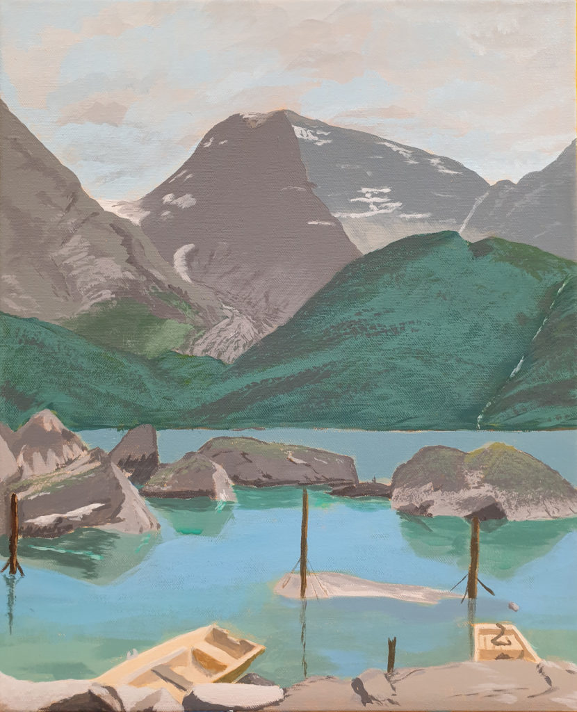
I have finished another painting, with a motive from near Odda. Yep, another nature motive – and in my humble opinion, I’m getting better at it. OK, it’s certainly not photo realism, but the colours are certainly getting more natural painting by painting. Which is what I’m aiming for in this kind of paintings.
Plus, of course, that the result is pleasing.
A lovely view
I painted this one only in the classes in evenings, and for this one, I made a very short video of the progress I did after every class.
My progress, evening by evening.
This view is towards the Folgefonna glacier, of which we can get a glimpse of.
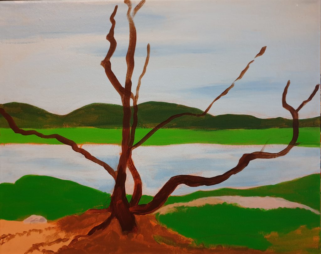
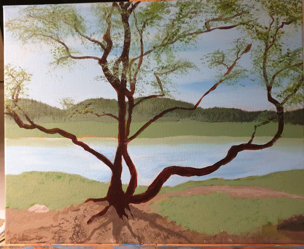
Once upon a time, I was walking up towards a local mountain top. Honest. Despite the beginning, it’s not a fairy tale! Didn’t walk alone, I had good company. But the point is: On the way, we were walking past a tree that I thought looked quite photogenic. So I snapped a photo.
Time came for me to find a new motive for me to paint. Well – why not use one of my photos? Like, the one of a particular tree? So I did.
Yeah. No plein air for me. I need much more experience and paint quicker for that to be a viable alternative for me. Maybe some day, but for now I’m happy when I can paint inside.
So, with the photo next to me, I started to block in the colours.
In the beginning there were bright colours …
The colours weren’t exactly accurate, comepared to the photo, but at least I had got the main shapes in place. And this process went fairly quick. For me. But this was only the beginning. I needed to do more!
Colour changing nature
The colours couldn’t be that bright. While the original photo is quite saturated, I’ve learned that more realistic paintings need to be more moderate to be believable. So to perform the necessary adjustments, colours were changed, and some details added.
I must admit, it looked a lot more “boring” after this, but it’s not always the right thing to go wild and saturated!
So I continued.
Leave the leaves
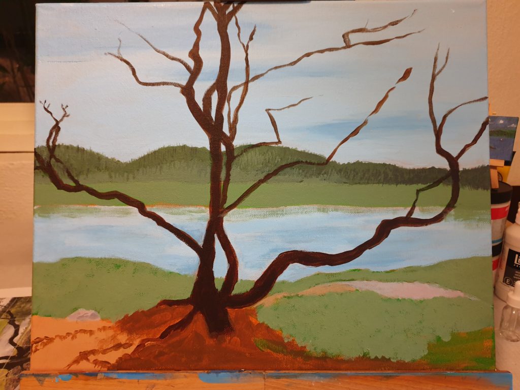
Some more colour adjusting helped immensely, and the tree shouldn’t be bare. It was autumn. It should be full of green leaves. So I added them.
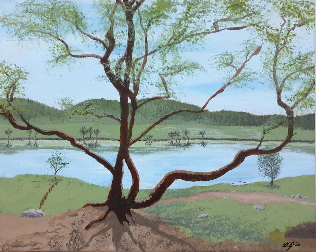
Ah! This was starting to look like something. While not as saturated scene as I might have wished for, I was happy with what I saw at this point.
Finished!
The last details were added. The painting was finished. The artist was happy. That is, me.
Is it identical to the photo?
Oh no!
But I think it’s a nice representation of what I saw, if simplified. And I’m ready to try a new motive, with new challenges.
What about the original?
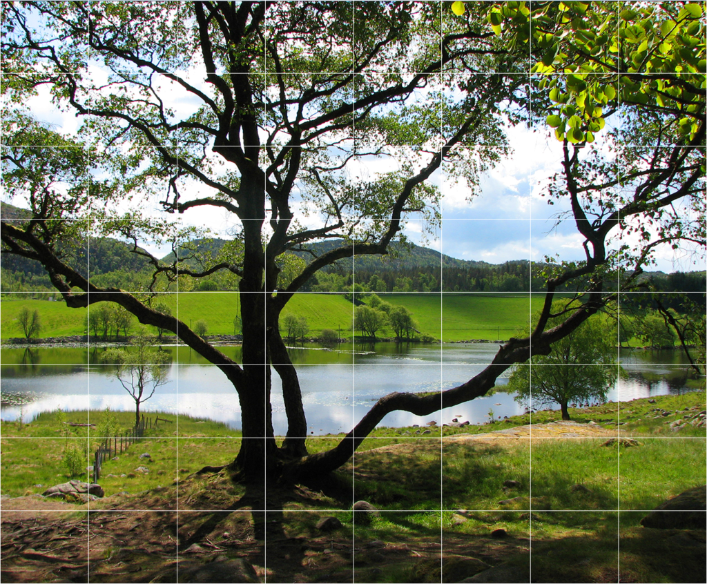
OK, some may be interested in seeing how close to the photo the painting is. And I can help you there. I’ll show you:
The photo itself
This is how the original scene is. As you can see, I’ve taken some liberties, and there are definitely some differences. Not only in colours. But it was a very nice inspiration for me, and I’m happy with the result. Which is more important than have it identical. At least this time.
The eagle eyed among you have noticed the square pattern over the picture. This is so that it will be easier to keep the proportions correct when transferring the image to canvas. You may also notice that I don’t have the correct proportions in my painting, compared to the photo.
Yeah. Well. I originally drew it nicely – but painted over the lines when I blocked in the colours – and didn’t bother to draw it in exactly as it was afterwards. I did it quick and dirty after memory.
Still, the lines are there, and if anyone wants to try to paint it themselves, feel free. It would be fun to see the results!
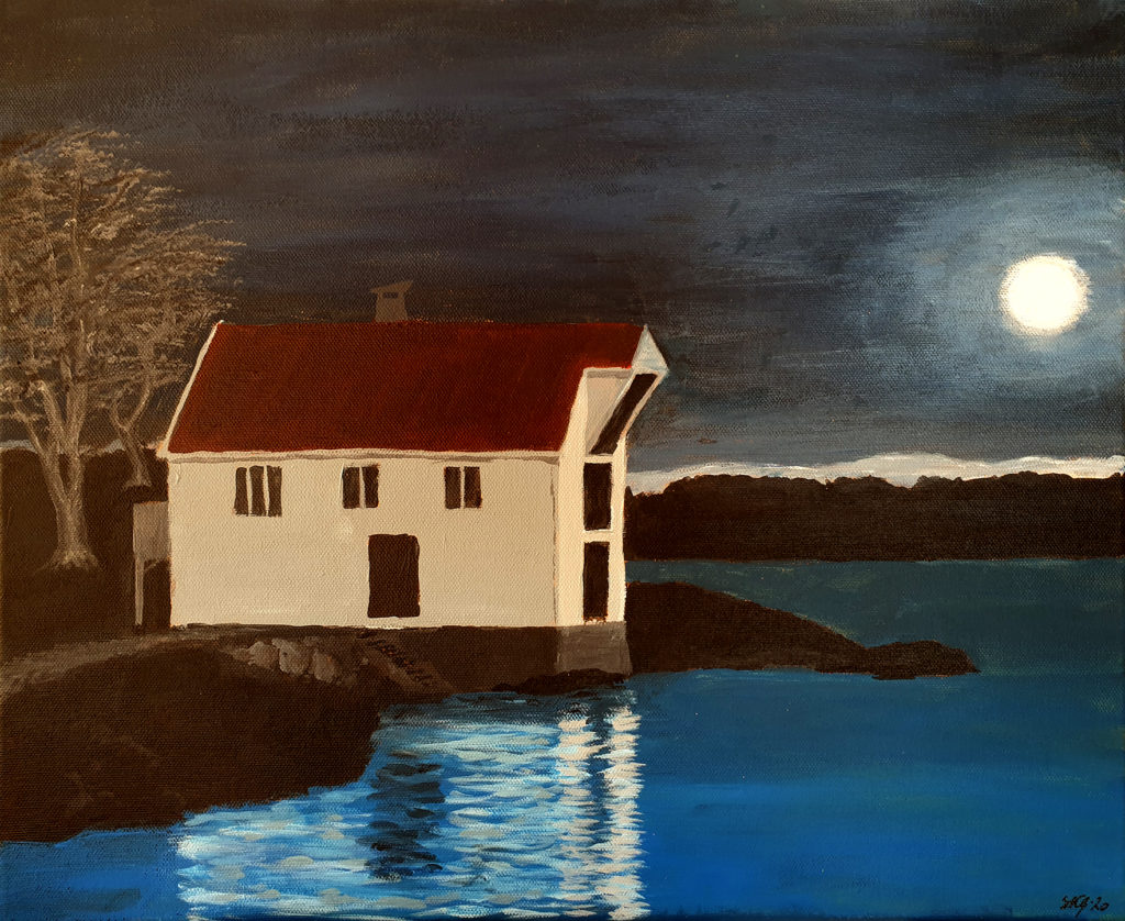
A sea house by the sea. Well – where else would it be? I was out with my nephew (one of them) one winter night photographing. Among several photos of this sea house, I thought this particular one would be very nice as a painting. So, I did what I had to do: I painted it!
A sea house from where I grew up
There are as always many things for me to learn still. I probably could work with this for many days or weeks yet to reach “perfection” – but I prefer to go on to the next motive. It helps me keep the enjoyment in it all, and it’s just so inspiring and encouraging to see the progress I do, it makes it all that more fun to paint. And to be honest, it’s the fun in this creativity that’s the most important for me.
Still, I do of course hope that you enjoy watching what I do, too 😉
I have painted sketch blocks earlier. Not inside them, but the covers. Apart from a quick and dirty test of something on my own sketch block, I’ve only shown the one I painted this summer. Now I’ve painted another one. I had a clearer picture in mind before I started, what I would paint.
The recipient of this sketch block enjoys playing his guitar, so the front cover wasn’t difficult to decide.
Whats better than a guitar player on the cover?
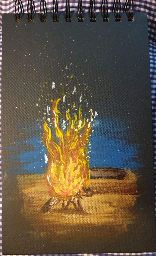
What should go on the back cover? Since its a black canvas-like cover, I wanted something that could light up in the night. Like a bonfire.
But where are the marshmallows?
A bonfire on the beach, a log to sit on – I wondered if I should paint a guitar leaning towards the log, too, but as the picture shows: I decided against it.
I’m happy with the results. While there, of course, are things that could be made better, I do see the progress I do myself. Which is fun and encouraging. And that is the main reason for painting in the first place, having some fun.
I just wrote about I have to take a break from the fiddly work resulting from painting all those small details in my endless, circular river picture. And I have started a new picture, from where I grew up. A sea house, after a photo I took one winter night.
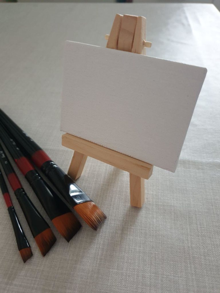
Now, I also have another project in mind, which isn’t a painting project, but one which includes the shaping of clay. Yeah, I want to make a clay figure. Some time. A figure that is painting, so I figured, I need a small canvas and easel. I could make it in clay, of course, but – I bought it instead.
My new canvas and easel. And the brushes too.
Of course, such a small canvas requires painting small details. Which is fiddly work, right?
Right!
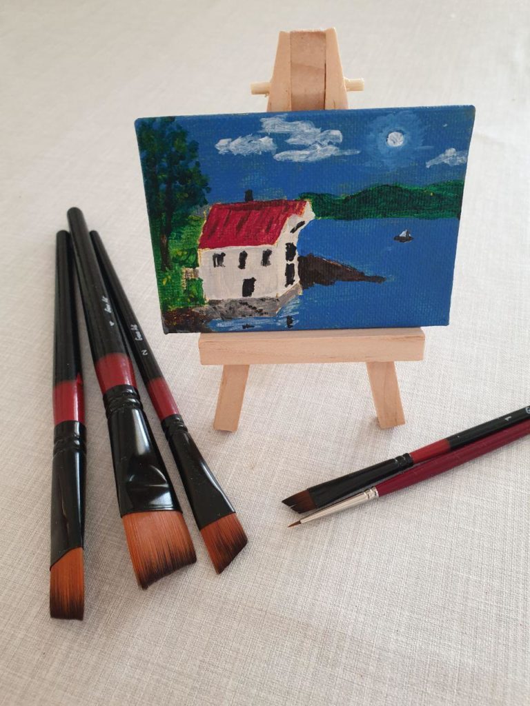
Good thing I’m taking a break from doing the fiddly work then. Except – well, it’s just such a tiny little canvas, it can’t take that much time to paint it. So I did. I spent quite a while to figure out what to paint, but ended up painting a miniature of the one I’m currently painting on a large canvas, just in summertime.
Sea house in summertime
It was a fun, little project. Sure, I could spend more time on it and get the details even better, but this was more for fun than anything else. Besides, I can buy more of those canvases without ruining myself, and the paint expenses should be manageable, too.
I wanted to paint a special landscape motive, inspired by M.C. Escher’s “Waterfall” – as told in an earlier post. At that time I had figured out roughly how the landscape should be, to achieve the needed optical illusion. This was harder than expected, so it took time. Some changes to the layout have happened after that, but now I’m happier with it. It’s mostly the smaller details that are left now. Details like forests, villages, farms and such.
This is fiddly work. Fiddly work takes time!
Time is an illusion. Lunchtime, doubly so.
Ford Prefect, Hitchhikers Guide to the Galaxy
Another thing I mentioned later, in my Summertime-post, is my lack of activity on that painting. Or painting at all, technically. Of course, I’ve started painting again now, as the previous post clearly indicates. I’ve just taken a break from the fiddly work, needed something else to concentrate on. Still, I’ve done something.
Notice the flattering shadow in the lower left corner ;p
The geography is now in order, it’s “just” the details that have to be added. Bit by bit. I’ll be working on it now and then, just to not get bored by the fiddly bits. In the meantime, I have a few other paintings of various sizes that need to take priority.
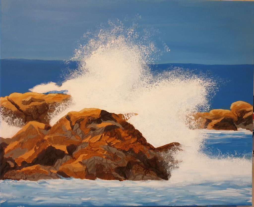
It’s time to paint again – and to finish the painting. And today I’ve done both. Judging from the ime I used, around five hours total actively painting, I think I do get somewhat better at it. I probably spent more time figuring out what to paint.
And, what did I decide to paint? The title of this post gives a hint, but you’ve probably already seen the painting below.
reaking waves
Quite a watery picture, with the splashing waves. Personally, I’m happy with the result. Just need to add my signature.
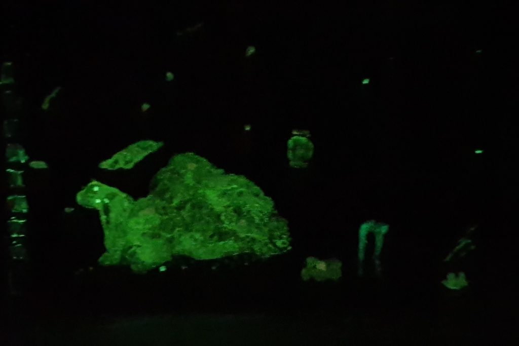
Sometimes, you just have to test something, either because it’s a new, unknown product, or because you want to try something new. Recently, I made a quick little painting, just as a quick little test. And as such, I didn’t care much about getting the right proportions and stuff like that.
So, I took my sketch block, made a quick and dirty sketch – on the cover – and started painting.
Not at all proper proportions on the figure – but a lot better than the sketch ;p
OK, so I painted on the cover of my sketch block. Big deal. What’s that got to do with testing something new, or unknown?
Well, I did mention in an earlier post, about the various acrylic mediums I bought, and there was at least one of them I just had to test, to see how it worked. And did it work like I hoped, and mentioned in that earlier post? Eagerly, I brought the sketch block with me to a little, dark room to see …
It’s dark. It’s glowing. It’s … green.
It was partly successful! It’s glowing in the dark, but I must admit: I had hoped it would take on a bit of the colour I had mixed in, but it didn’t. It glowed green.
Well, come to think of it, the test itself was 100% successful. It didn’t give me the results I hoped for, but now I see what it does, and I can take that into consideration when thinking of other projects where it can be used. Some ideas are already entering my thought train. Let’s see what station they leave at.
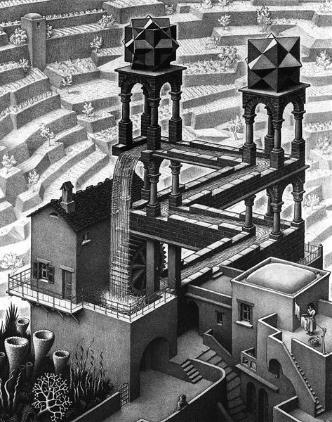
I guess we all have seen various optical illusions; drawings that can be seen as two different things at the same time, images where the shapes also seem to hide or form other figures, geometrical constructs where the angles seem to be OK, but at the same time are completely impossible.
Waterfall by M.C.Escher
One well-known artist of the impossible geometry is the Dutch Maurits Cornelis Escher. Way more can be said of him and his art than I will do, other than that he serves as the inspiration for one of my paintings in progress.
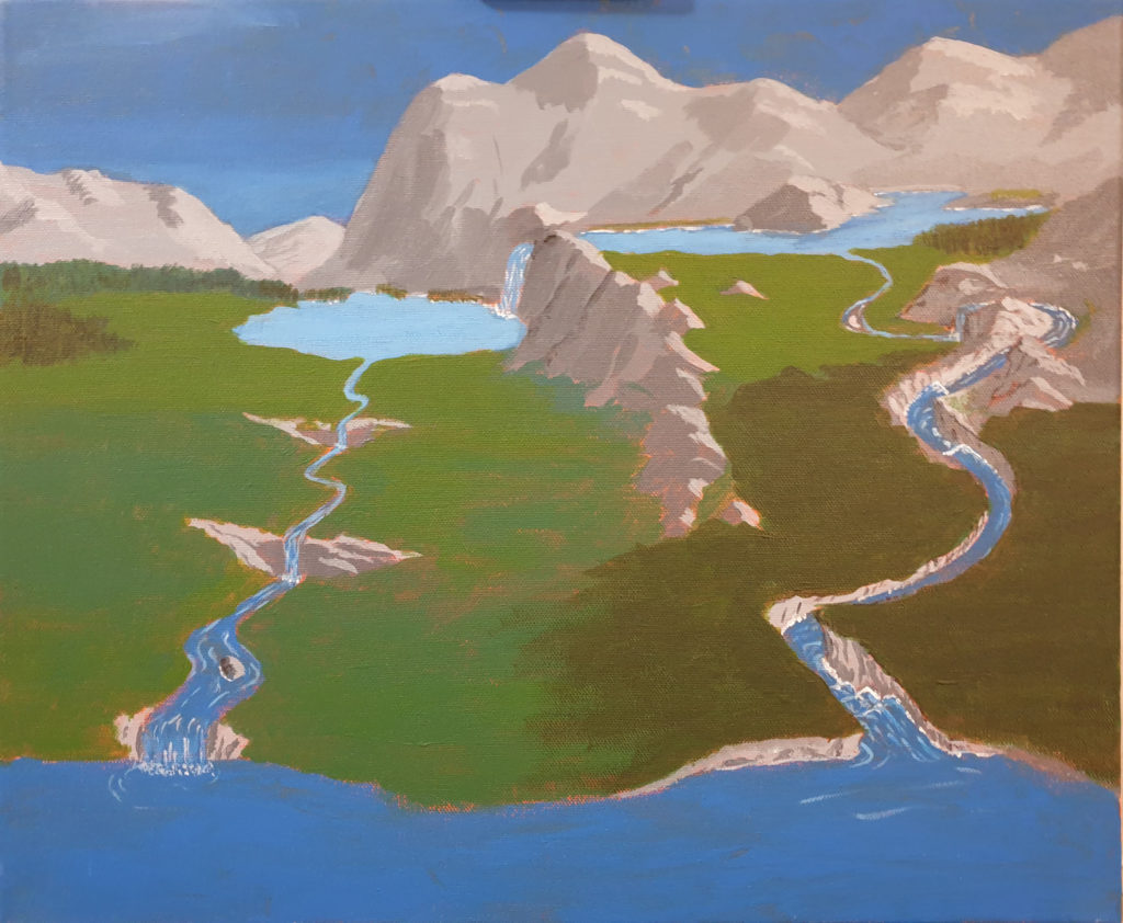
The image I’m thinking of is “Waterfall” – impossible geometry where the water flows down in an aqueduct all the way, and ends up in a water all down into the beginning of the same aqueduct. All the action takes place in a limited space, and it’s easy to see how it’s done. But in my mind, I was playing with the idea of taking the same principle and transfer it into nature, making a believable picture, despite the water flowing downwards all the time, in a circuit with several waterfalls. Would it be possible?
I had a rough idea, sketched it on paper, just as rough, and decided that yes, it would be possible. Then I had to decide if I should make a more detailed sketch, using photos and stitch together something in Photoshop, or just start painting, with that rough sketch as my starting point. I went for the latter option, as the rest would have me spend way too long time before I could start painting at all.
It started out nice and quick. I blocked in the colours for the first shapes; sky, mountains, water, ground. Added some more details after I decided where the light should come from. Made the river flow from the lake in the distance towards a lake in the foreground, with some waterfalls on the way to make it obvious. Then the time came for me to make the river flow back, down from the current low point to the starting high point …
OK. It’s easy enough to make the river flow downwards, but it should also look natural. I spent some time thinking of this. It started getting hard …
Work in progress. I’m getting there, but lots of work left.
As it is still a work in progress, I’m not finished. By far.I’ve blocked in the main colours, so I see the shapes and things are getting clearer. There’s still a lot of details that need to be painted though, but there is one thing that’s getting very clear to me: I was overly optimistic about the time I would use on it. There’s more thinking to do than expected, to make it look convincing. So much that it has been hard to sit down and do some actual painting. There are other pictures I want to try, too, so maybe I’ll just start that before I finish this one. Luckily, that’s very much allowed. Getting my spirits high on painting something that doesn’t require this much thought can only be of the positive, and it’ll make it easier to start on this one again. I hope.
Sounds like I’m trying to convince myself here, but in any case, I’ll have to get some painting done again, and show it.
Painting with acrylics doesn’t have to be on canvas or paper only, it can be used for a lot of projects. I’ve mentioned models earlier, pre-made or homemade sculpts in clay, but of course, there’s 3D-printed stuff, objects made of wood, fabric, smartphone covers … Quite a lot, really.
Of course, some surfaces needs to be prepared in some way; they might be sanded, or primed. A wooden plate, or object, might be primed with gesso, to make it easier to paint, and using less paint in the process.
There are also different acrylic mediums, to be used with different materials. A fabric medium is perfect if you want to paint on your clothes, for example; it makes the paint easier to work with, and the clothes won’t be stiff like they might be if painted without the medium.
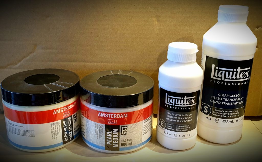
But there are mediums that are useful on your canvas (or other preferred painting surface) too. I got a little selection myself …
Various acrylic mediums, for future enjoyment
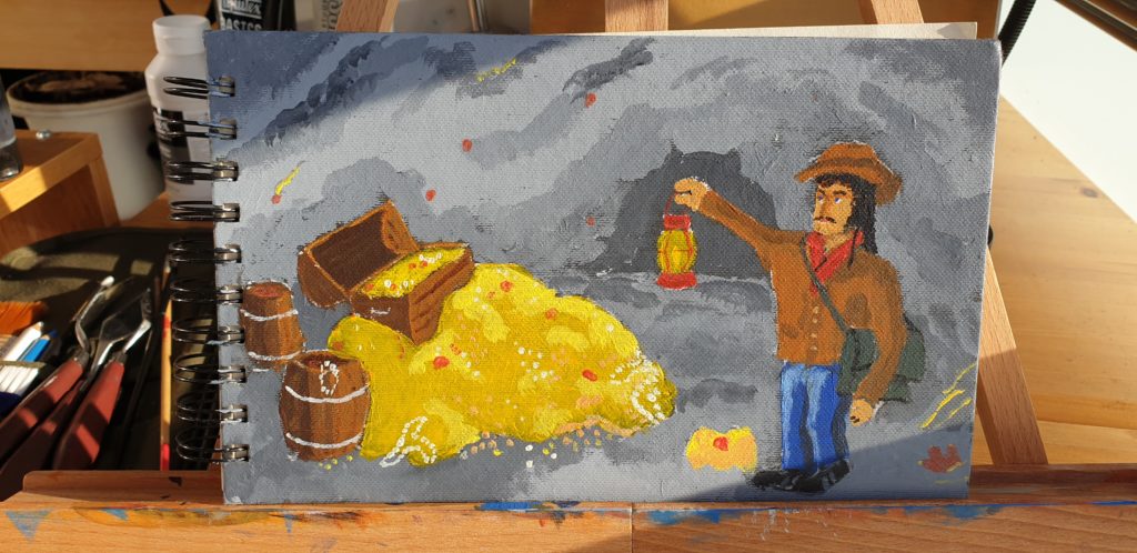
I was looking for some clear gesso, to prime a little wooden chest that I want to paint, in the style of an old treasure chest. I found it, but there were also a few others that caught my interest: What about a glow-in-the-dark medium? Cool! An image from computer games came to mind: A dark cave, with glittering, illuminating gems … Can be fun to see it in the dark.
A pearl medium? I’m sure that can be fun to try, too. And what about a shimmering/iridescent medium? Oh yes. I’m sure that cave with the gems can have a nice treasure, too, with shimmering valuables …
My mind is toying with the idea, and is a lot further on the path than my painting. I still have a special nature-motive I’m working on. But I’ll get there, it will all be used!