Painting outside, even if you’re inside?
Why not, if you let your imagination free …
My thoughts and whatever about random topics.
Painting outside, even if you’re inside?
Why not, if you let your imagination free …
The alternative title for this post could be “The Unfortunate Crow”, for obvious reasons. It’s quite a while since now, that I saw this crow in the snow one winter, trying to eat some snow. Probably the easiest way for it to get something to drink.
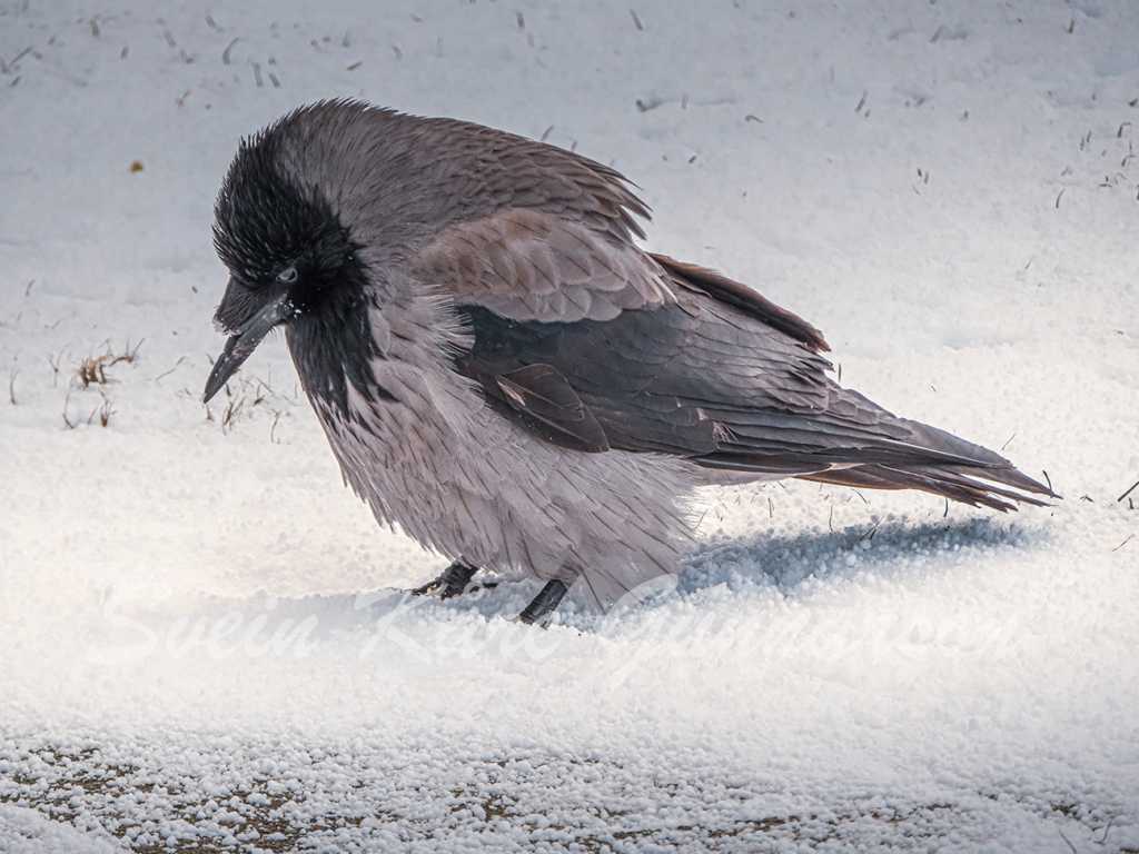
A crow isn’t, I must admit, a bird I pay too much attention to normally. This time, tho, I soon discovered the problem it had to cope with: The broken beak. I quickly turned on the camera on the phone and snapped a few pictures, where it stood just a couple of meters away from me. Maybe three.
Also, instead of being a bird I don’t care much about, this one I felt sorry for. How long had she lived without the beak? How did she break it? How long would she live now? I found myself wanting to give her a beak prosthetic, but two things stopped me: First, I would have to catch her (she ignored me when I asked her to come to me) and second, I would have to make her that prosthetic.
I gave up that thought.
Instead, I toyed with the thought of painting her. Now I’ve finally done it.
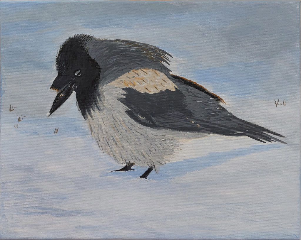
I’ve never tried to paint anything photorealistic, and all the details in the feathers scared me away from painting this for some years. But while I may enjoy doing some fiddly details, it’s first now that I’ve painted a few years and learned a bit I found this picture again with the intent to paint it. Faking the details.
In the process, I noticed for the first time that the crow isn’t just pure black and grey – there’s also some brown in there. I do notice more details when I study something to paint than I used to. Cool!
So, how should I paint it? Photorealistic is out of the question. The details is way too finicky for my abilities. Maybe one day, if I want to spend ages on one painting, but for now I had to simplify, a lot. Some lines to indicate the direction of the feathers are what I went with.
Currently, I’m very happy with what I’ve managed.
In painting class this time, I chose to paint a vase of poppies – inspired by one of the pictures presented to us. Many of us did paint this one, and it turned out in just as many variations as we were artists. (Yes, we’re artists, right? Just not professionals who do it for a living.)
The original painting was in a loose style, not too detailed, but still giving the impression of details. It spoke to me, so I decided to paint it. In my style.
Or at least, in my current style? One of my styles? As I’m still learning different methods all that will develop until I settle on what I feel most comfortable with and prefer. Probably.

I’m still exploring those rough, loose brush strokes. There are not really any details, just big, rough areas in the background, and some vague, flower-like shapes for the poppies. The colour variations give it a 3D look, and some smaller strokes, dots and areas give the impression of more detail than what’s actually there.
Could I’ve done more with this? Absolutely! But – I didn’t want to. Had I done much more, the painting would’ve changed completely, possibly ruined. And, I was happy with the current result, so why would I even try?
A little week ago, I got the challenge to paint an apple. And why not? I’ve painted an apple before, but at that time it was a digital painting and a realistic painting. Of an apple. Not so this time. I wanted to challenge myself and paint in a style I usually don’t try …
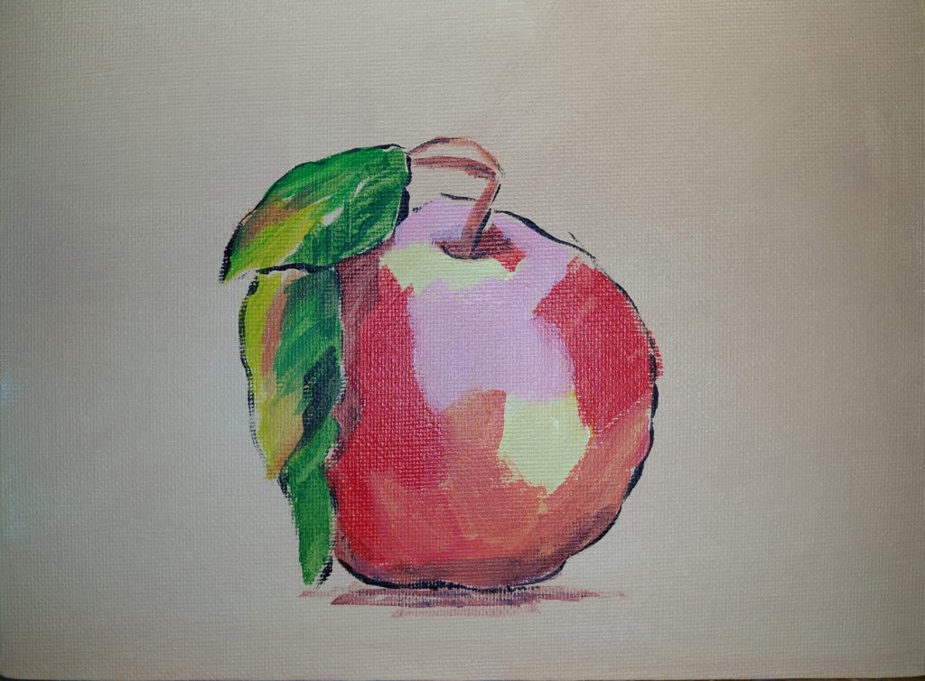
I want to be able to paint looser, with rough brush strokes. Much like I did with my autumn-painting, but even rougher, using larger brushes. Trying it with an apple, well, that seemed easy enough. Not that much that can go wrong 😉
So, first, a thin brush, to make the black outline. Or well, first covering the canvas in a light brown colour, and then the outline. The next step was to find the main colours and drop them in, not worrying too much about getting it exactly right. Add some variations here and there.
Pink, yellow, orange, brown and red. That makes it a perfect red apple, right? And some dabs of different colours make the green leaves look a lot more detailed than what I painted.
I’m happy with it. I think I succeeded in what I set out to do.
I wanted to paint a lighthouse in stormy weather, and with the help of AI I made some images that I used for inspiration
It’s been way too long since I’ve updated this blog now. Shame on me. Admittedly, I did post my lighthouse painting on Instagram, but I never got as far as writing about it here. So, time to do something about that.
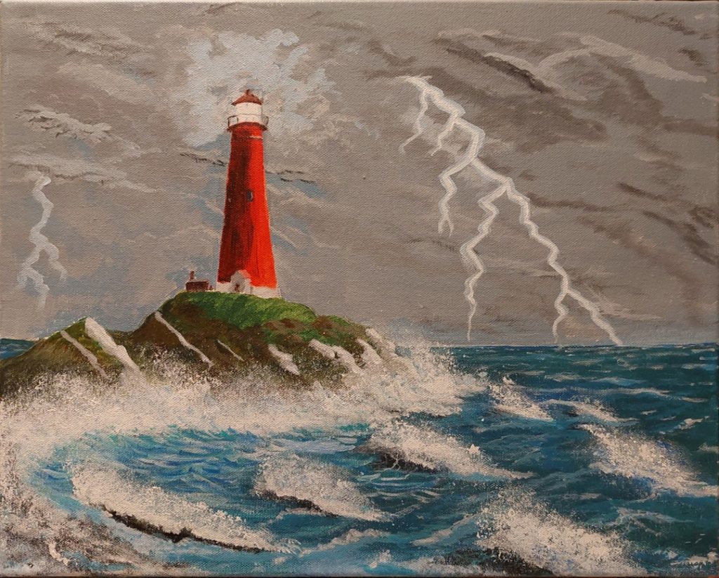
I painted this between Christmas and New Year, and was joined by mother who got inspired and wanted to paint a specific lighthouse on the Norwegian coast. One known as the most beautiful lighthouse in Norway. For me, it started with an idea: I wanted to paint a lighthouse, and I wanted it to be in stormy weather.
To achieve that I needed some reference pictures, but instead of searching for photos that I could use, I used one of the AI art generators to give me suggestions. A few tries and I got a few results that inspired me.
I mixed the ideas as I painted on the canvas; the sky from one image, the lighthouse and environment from another, and the waves varied a bit. The resulting picture is different from all of them, but I got the inspiration I wanted, and since the motive is imaginary in any case, I could easily take my artistic liberties and not make the lighthouse exactly as the picture. Although it mostly is. ????
There are still things I should practise, just to be able to paint better. There’s always something new to learn. Still, while I see the things I could do better, I’m still happy with what I made.
The topic: Trees. Theme: Autumn. At least, it was autumn for my part. And yes, this was a new challenge in the painting class, where we after an introduction to how different painters painted trees, and how their expressions changed during their lives, could either copy one of them, in our own styles or be inspired by them.
And there were many styles to choose from, too—anything from serene, naturalistic scenes to completely abstract, from many colours to few colours. Personally, I fell for a forest scene, with only trees. And painted in black and white (well, greys) except for one tree, with its leaves in full autumn colours. And a couple more.
That’s what I was inspired by. Except, I didn’t want a forest scene, I wanted something more urban. A little glimpse of the urban, but not any too straight lines. And, the result?
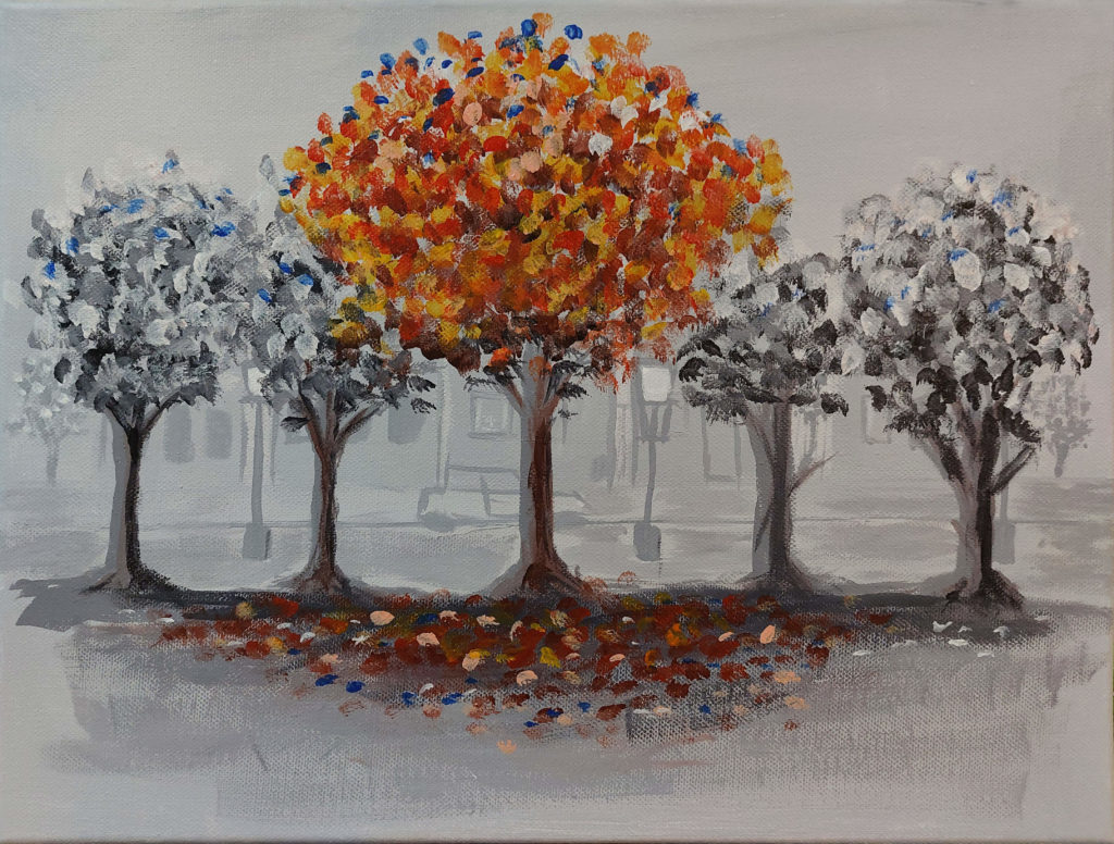
A few lines and squares in the background give the impression of buildings and windows. A car and a few streetlights make the impression stronger, and then the trees are in the foreground. Grey, except for the largest one in the middle, which is where all the golden autumn colours are concentrated. Spots of colours represent the leaves, both on the tree itself and fallen down on the ground.
All of this was done with loose brush strokes, much looser than the painting that inspired me, but – I’m happy with the result. It’s the first time I’ve tried something like that, so it was a win for me, all done in a short evening.
I am taking classes in acrylic painting this autumn, too. Technically the same class as before, according to the description, but we’ve always just continued from where we were on our path to professional artists. Or on the path to just enjoying painting in itself. This time, with a new teacher, things changed – but more about that in a later post.
Enough about that, except that we do get challenges every time. This summery painting of a sunflower field is the result of such a challenge.
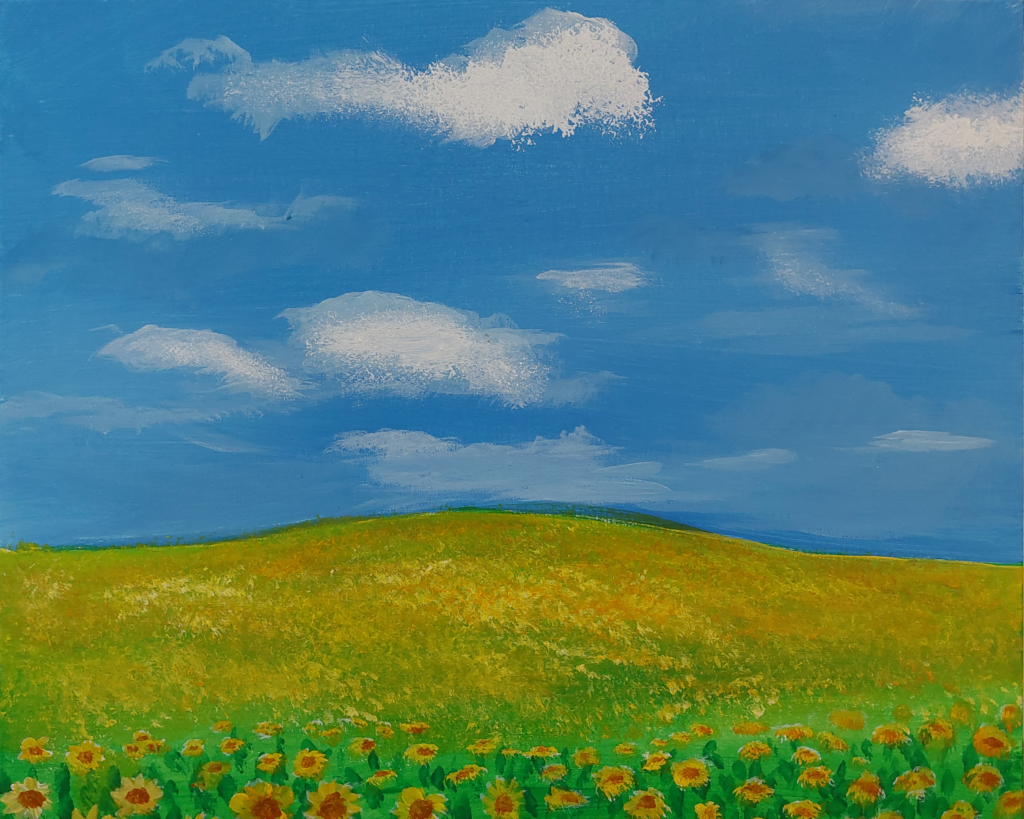
A quick painting, but showing enough variety and detail to … make the impression there are details present. It’s really not, not much.
I think that’s cool!
Around Halloween, it was time again for a new five-day portrait challenge from Paintable. Last time, this spring, was my first time trying it, and also my first time painting a portrait. At least in a serious way. Would I get a better result this time? Only one way to find out: I had to do it!
The task was like last time, except for one twist. Since Halloween was approaching fast, the final portrait should be of a monster; zombie, vampire, witch, whatever. Either make the monster from the start or take the finished painting and make it into a monster. I decided to make a vampire. A female one.
So I got my model, placed some lights where I wanted them to create the mood, and then I was ready to take the steps as usual.
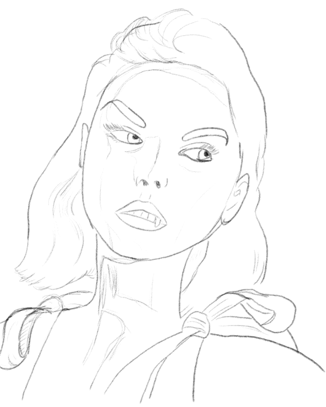
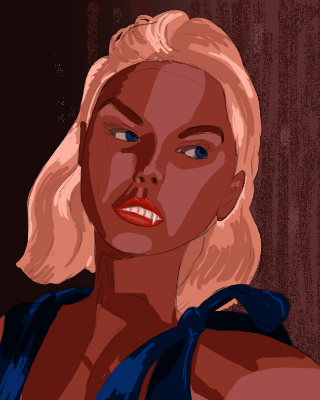
Light, medium and dark skin tones. That’s how it’s usually done at this step. And I started that way, but … this time the lighting was more complicated. I had used both red and blue lights, and the shadows, were bluer. I had to fix that, so in my next step, the blue shadows were added in addition to the smoothing the colours.
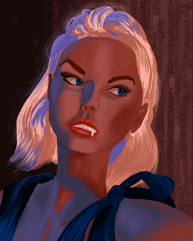
With the colours I wanted in place, and smoothed out for a natural result, things are looking good. I still have to do something about that hair, and there are details that need to be taken care of.
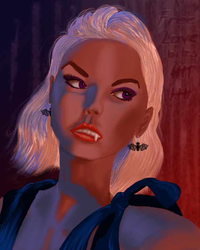
Hair straightened out and made look more like hair. Earrings were added, in the shape of bats, of course. She’s a vampire, after all. Should the eyes stay blue, or should they be more mysterious? Red or yellow were too common for monsters – I made them purple. The teeth were still too white, so I changed those, too, slightly.
I also added the lighting to the background, and some other details, slightly out of focus. It’s already a lot better than the one I did in spring, but I want a final touch-up.
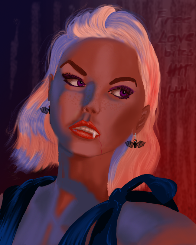
I wanted the hair to look even more like hair, so I spent some time brushing it. Digitally, at least. She got some slightly lighter irises, and some cute freckles were added. And a slight trickle of blood from the side of her mouth, after the free lovebites she’s been giving.
Am I happy with the result? Indeed I am!
I haven’t forgotten about the traditional, analogue painting in favour of the digital versions, and I have no plans of giving it up. This summer I used acrylics again and painted some cascading waters. Was I finished, or did I need to do more?
I decided that I did not want to do more with it. Does that mean I’m finished with it? Well, let me quote a painter with more experience than me:
A painting is never finished, it is only abandoned
Leonardo da Vinci
Good enough answer?
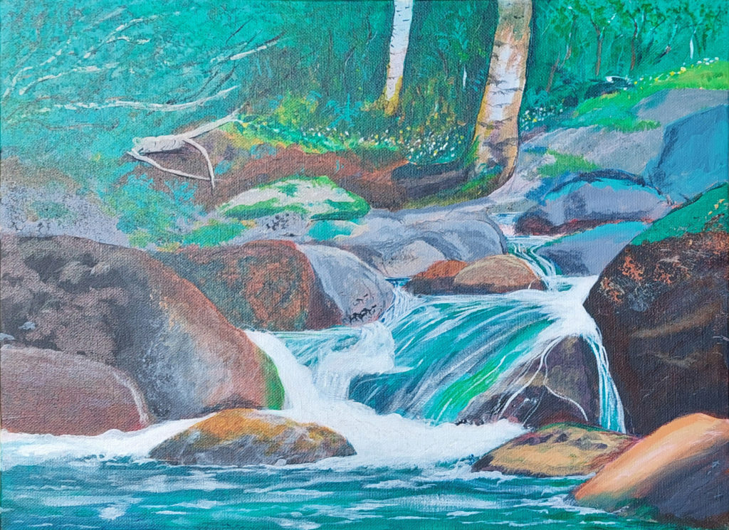
Motive is inspired by (i.e. not identical to) a photo I took home on the island where I grew up. It shows that even a little stream can be a nice motive to paint. The motives don’t have to be limited to bigger, amazing views!
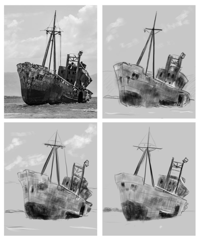
Exercise: Find a picture. Make a sketch of it, or rather three sketches, in 20, 15 and 10 minutes. Well, I did. The question is: How well did I do?
I do see that while I concentrated on different parts each time, I also got more secure in my lines. Even if I didn’t get all the measures correct each time … but if I did this exercise several more times, I’m sure the difference between the sketches would be larger.
