 The first incarnation was only a few pages, and the menu on the home page was inspired by a road sign, with the signs pointing in different directions to the different pages. It worked nice for a while, but as new pages got added another menu was added – but it grew impractical very soon. A version of the moonbase menu saw the light quite soon,
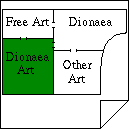
  and the submenus on the pages in the different sections was modelled as blue prints of the buildings, one room was a link to one page. A pretty nice design – but it soon grew impractical as more pages were added, even if buildings got a second floor for this reason. It got replaced by normal menus; graphic versions of what exist today.

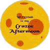
 The front page got busy – and maybe a bit large – and since this was in the time of splash pages I added one myself. I drew a simple, cartoony full moon and invitet people inside. Later I replaced that moon with the real one – or at least a picture of it. (The old one was missed by one person – hi Jody – but I stuck with the new.)
The main page – the moonbase – got bigger and bigger, and the splash page started to get some content to relieve it. The full moon got replaced yet again, by the picture you still see at the home page today, only a larger version. More content was added to the home page, and today it has gone the full circle by having a menu from which you can reach all the sections in this site. It’s now the new main page.
What will happen with the old main page now – the “street map” in the sub menus? It’s no longer needed, is it? But still – I’m going to keep it. I don’t know how long time I will need to transform it into what I dream of, but I want it not only to be a main menu as it is today, but an experience to enjoy. It will take time, but until it’s ready: I go step by step.
