Free Willy! That was the comment when I said I wanted to paint an orca. I pondered the iconic movie poster as an inspiration but settled for focusing on the orca. Or an orca, as it’s not exactly “Willy” himself.
This was a continuation of the watery challenge mentioned in an earlier post. Still, instead of staying underwater, I went with a creature that stays primarily submerged in water, breaking the surface to breathe, or to have fun. And as I revealed already in the first paragraph, the creature is an orca.
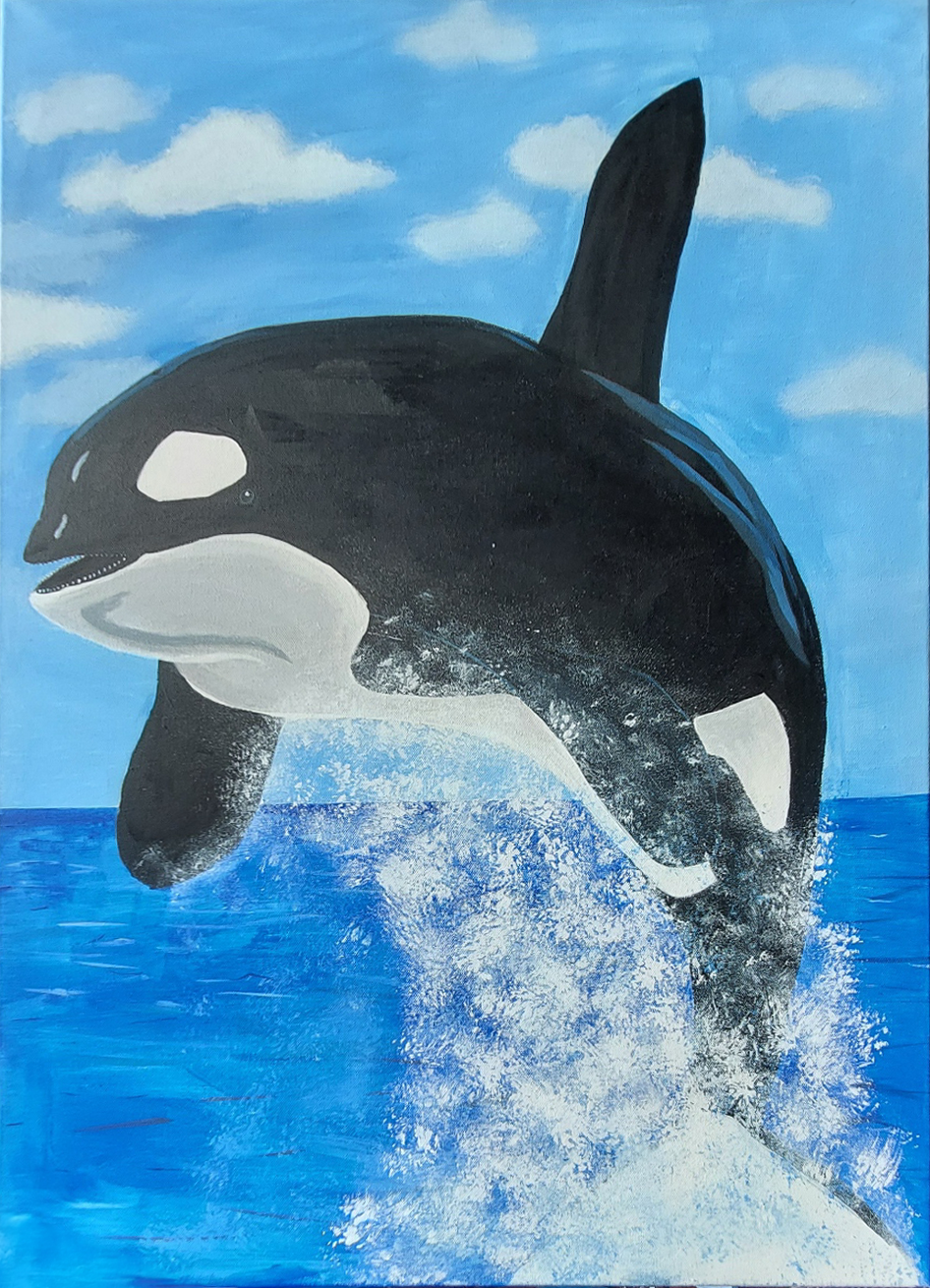
And I really wanted to challenge myself, by using the largest canvas I have. Well, an orca may not be the most difficult subject to paint being black and white, but then again shadows and highlights are essential not to make it look flat.
Blocking in the colours was quick, but then there were the details. While this isn’t a realistic style painting, adding details to the painting still takes time, at least for me. I’m sure it’ll get easier and faster with experience.
When I look at it now, I see all the things I could do differently or better, but I still got nice responses from people who like it. This just goes to show yet again: There’s no one more critical of my work than myself. Maybe this was what Leonardo da Vinci had in mind when he said “A painting is never finished, only abandoned.”