Around Halloween, it was time again for a new five-day portrait challenge from Paintable. Last time, this spring, was my first time trying it, and also my first time painting a portrait. At least in a serious way. Would I get a better result this time? Only one way to find out: I had to do it!
The task was like last time, except for one twist. Since Halloween was approaching fast, the final portrait should be of a monster; zombie, vampire, witch, whatever. Either make the monster from the start or take the finished painting and make it into a monster. I decided to make a vampire. A female one.
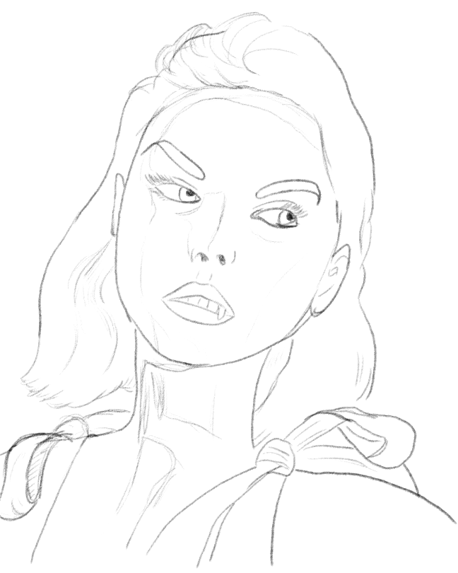
Start sketching
So I got my model, placed some lights where I wanted them to create the mood, and then I was ready to take the steps as usual.
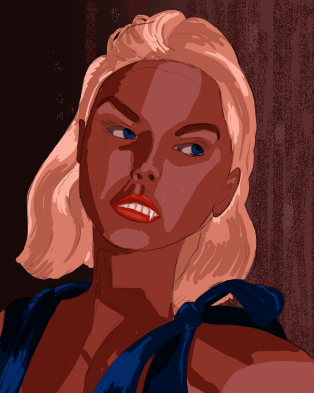
Light, medium and dark skin tones. That’s how it’s usually done at this step. And I started that way, but … this time the lighting was more complicated. I had used both red and blue lights, and the shadows, were bluer. I had to fix that, so in my next step, the blue shadows were added in addition to the smoothing the colours.
With the colours I wanted in place, and smoothed out for a natural result, things are looking good. I still have to do something about that hair, and there are details that need to be taken care of.
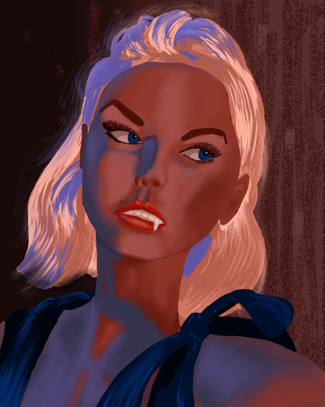
Hair straightened out and made look more like hair. Earrings were added, in the shape of bats, of course. She’s a vampire, after all. Should the eyes stay blue, or should they be more mysterious? Red or yellow were too common for monsters – I made them purple. The teeth were still too white, so I changed those, too, slightly.
I also added the lighting to the background, and some other details, slightly out of focus. It’s already a lot better than the one I did in spring, but I want a final touch-up.
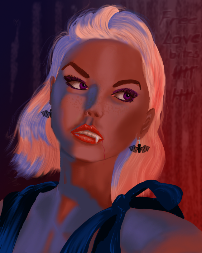
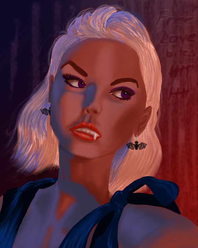
I wanted the hair to look even more like hair, so I spent some time brushing it. Digitally, at least. She got some slightly lighter irises, and some cute freckles were added. And a slight trickle of blood from the side of her mouth, after the free lovebites she’s been giving.
Am I happy with the result? Indeed I am!