Once upon a time, I was walking up towards a local mountain top. Honest. Despite the beginning, it’s not a fairy tale! Didn’t walk alone, I had good company. But the point is: On the way, we were walking past a tree that I thought looked quite photogenic. So I snapped a photo.
Time came for me to find a new motive for me to paint. Well – why not use one of my photos? Like, the one of a particular tree? So I did.
Yeah. No plein air for me. I need much more experience and paint quicker for that to be a viable alternative for me. Maybe some day, but for now I’m happy when I can paint inside.
So, with the photo next to me, I started to block in the colours.
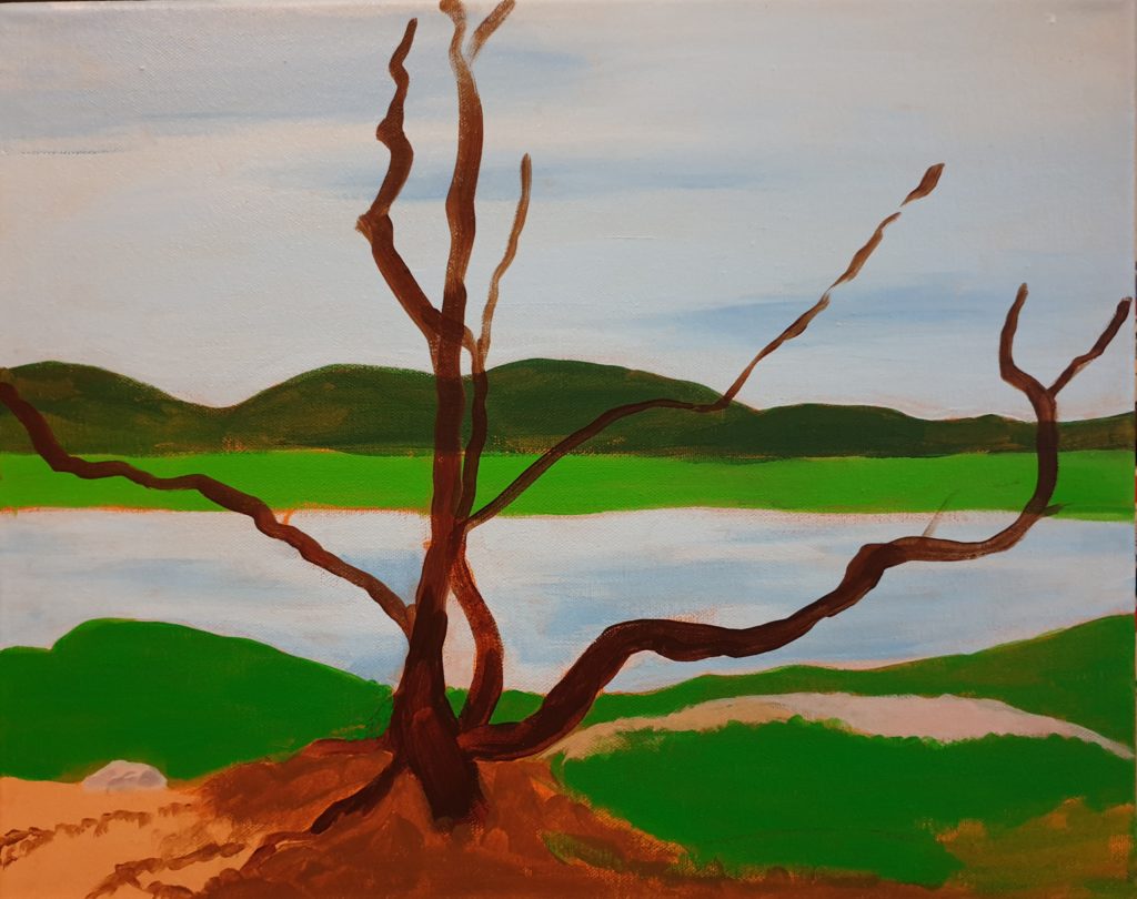
The colours weren’t exactly accurate, comepared to the photo, but at least I had got the main shapes in place. And this process went fairly quick. For me. But this was only the beginning. I needed to do more!
The colours couldn’t be that bright. While the original photo is quite saturated, I’ve learned that more realistic paintings need to be more moderate to be believable. So to perform the necessary adjustments, colours were changed, and some details added.
I must admit, it looked a lot more “boring” after this, but it’s not always the right thing to go wild and saturated!
So I continued.
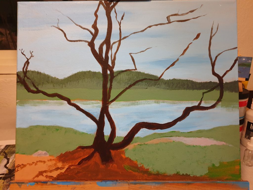
Some more colour adjusting helped immensely, and the tree shouldn’t be bare. It was autumn. It should be full of green leaves. So I added them.
Ah! This was starting to look like something. While not as saturated scene as I might have wished for, I was happy with what I saw at this point.
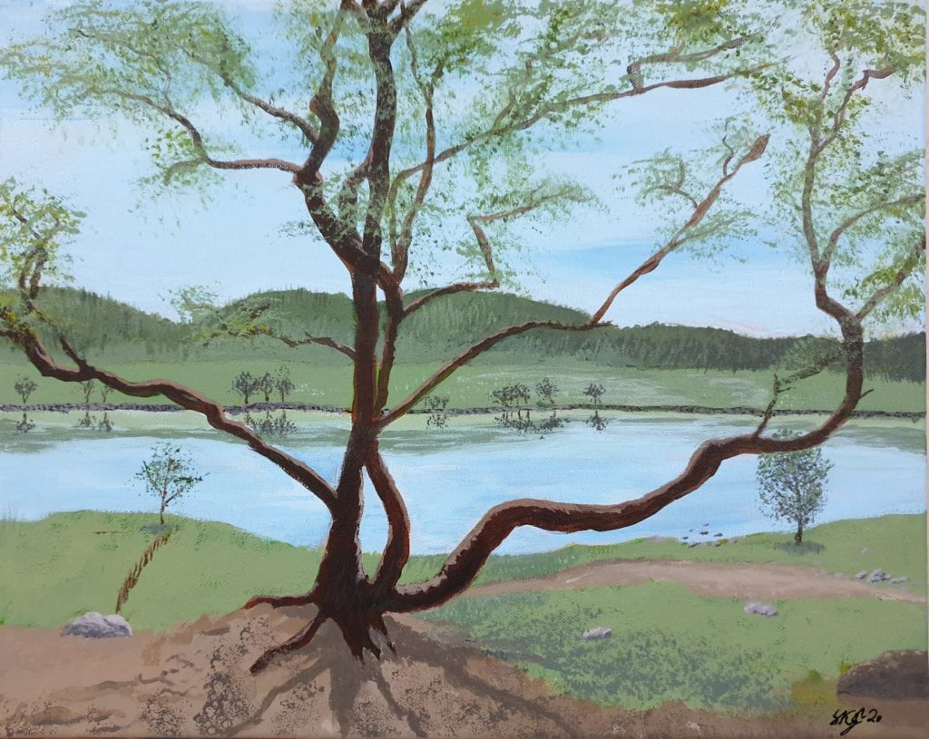
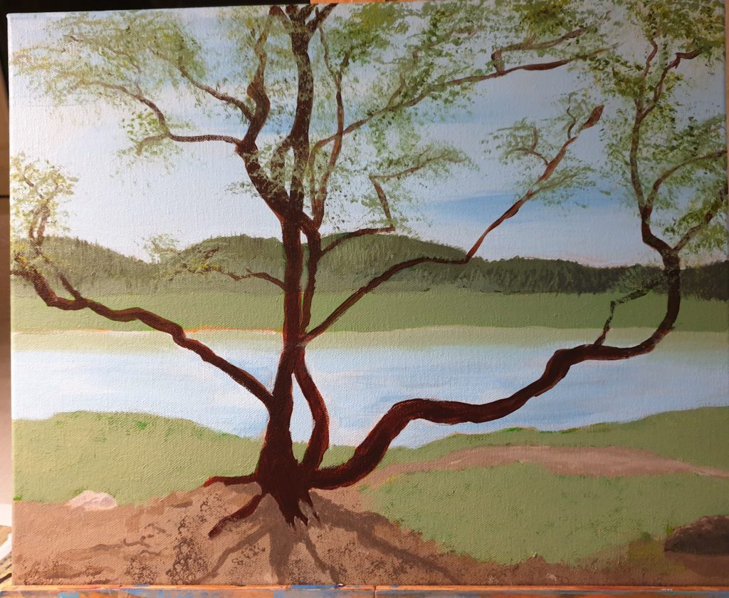
The last details were added. The painting was finished. The artist was happy. That is, me.
Is it identical to the photo?
Oh no!
But I think it’s a nice representation of what I saw, if simplified. And I’m ready to try a new motive, with new challenges.
What about the original?
OK, some may be interested in seeing how close to the photo the painting is. And I can help you there. I’ll show you:
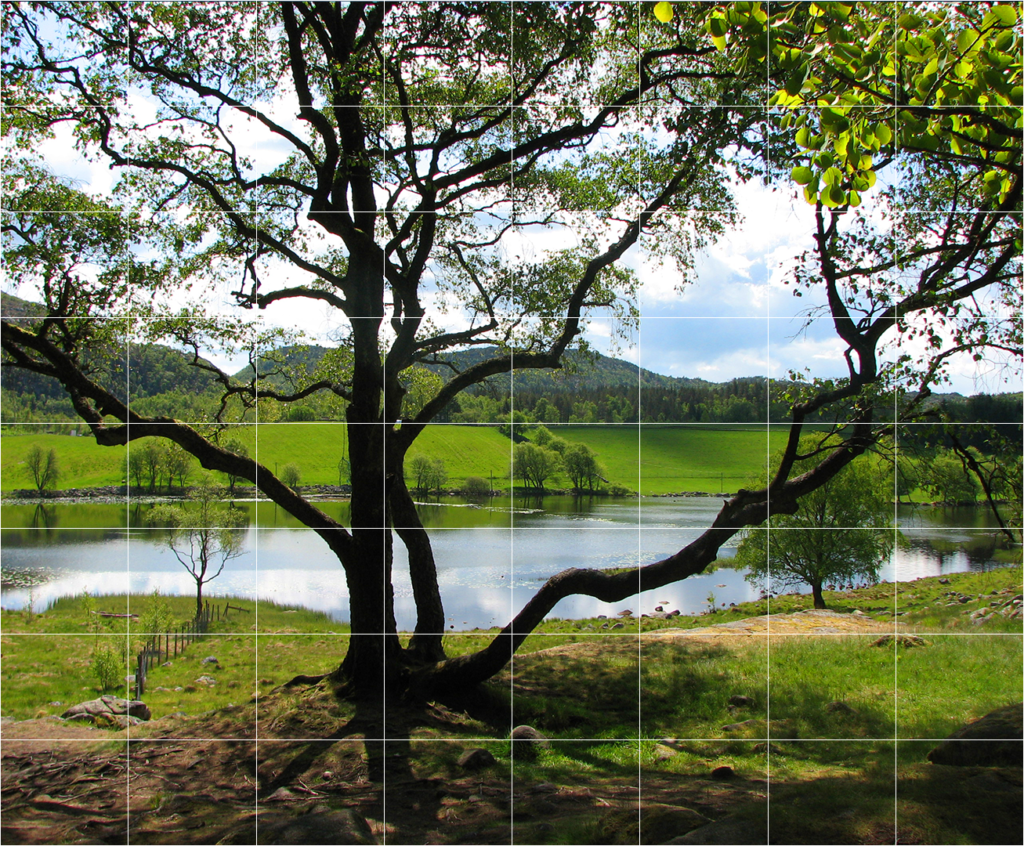
This is how the original scene is. As you can see, I’ve taken some liberties, and there are definitely some differences. Not only in colours. But it was a very nice inspiration for me, and I’m happy with the result. Which is more important than have it identical. At least this time.
The eagle eyed among you have noticed the square pattern over the picture. This is so that it will be easier to keep the proportions correct when transferring the image to canvas. You may also notice that I don’t have the correct proportions in my painting, compared to the photo.
Yeah. Well. I originally drew it nicely – but painted over the lines when I blocked in the colours – and didn’t bother to draw it in exactly as it was afterwards. I did it quick and dirty after memory.
Still, the lines are there, and if anyone wants to try to paint it themselves, feel free. It would be fun to see the results!