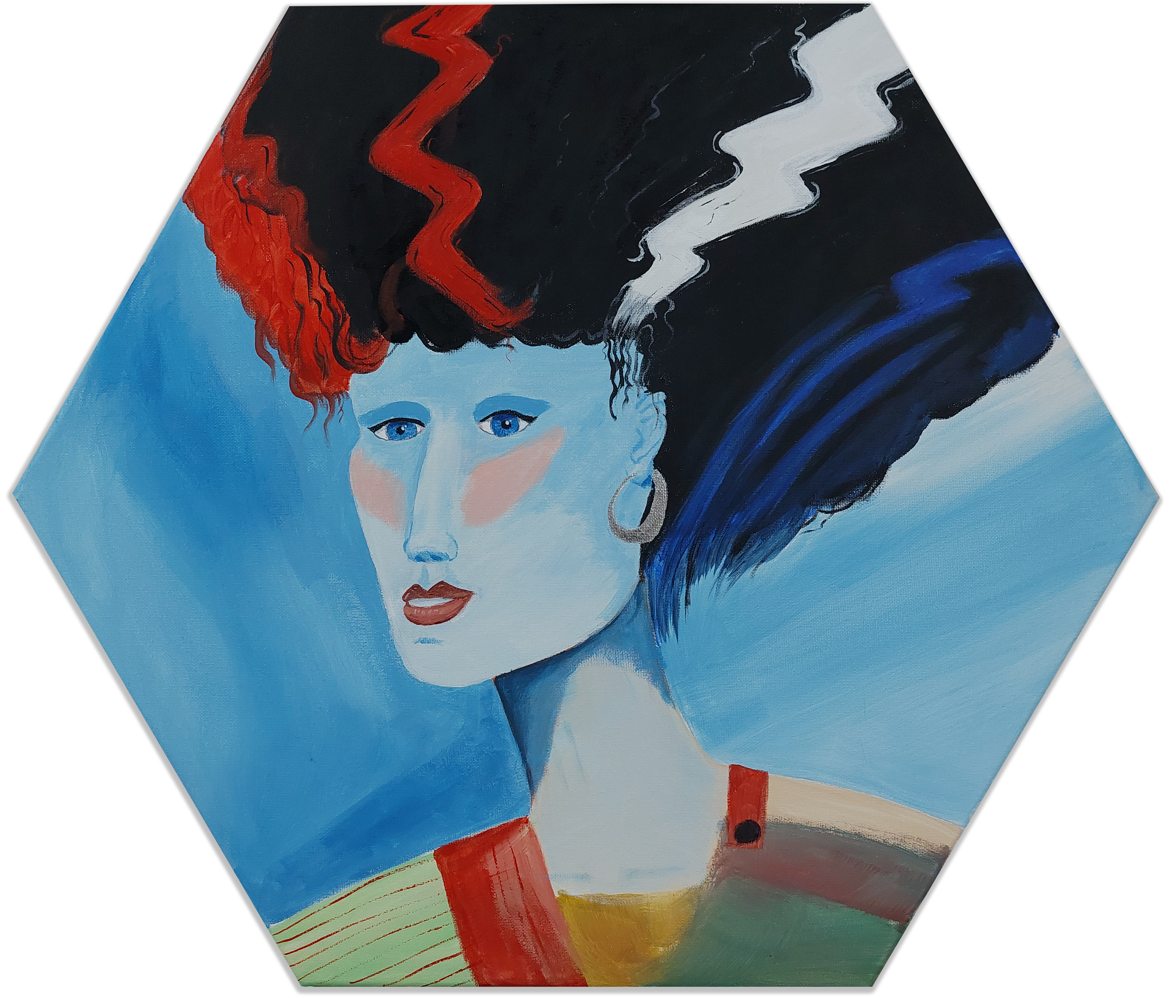
Briefly inspired by a colourful image that I don’t remember what it looked like, combined with a comment (before I started painting this) that people don’t have blue skin, I decided I wanted to have some fun when taking on this challenge.
It can certainly be better, but I had fun with it! And I still might change it a bit later.
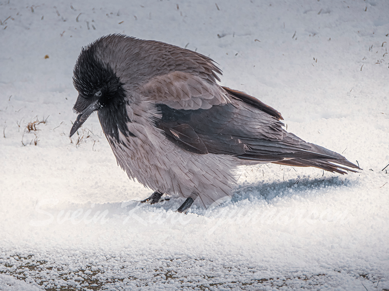
The alternative title for this post could be “The Unfortunate Crow”, for obvious reasons. It’s quite a while since now, that I saw this crow in the snow one winter, trying to eat some snow. Probably the easiest way for it to get something to drink.
My photo of the unfortunate crow
A crow isn’t, I must admit, a bird I pay too much attention to normally. This time, tho, I soon discovered the problem it had to cope with: The broken beak. I quickly turned on the camera on the phone and snapped a few pictures, where it stood just a couple of meters away from me. Maybe three.
Also, instead of being a bird I don’t care much about, this one I felt sorry for. How long had she lived without the beak? How did she break it? How long would she live now? I found myself wanting to give her a beak prosthetic, but two things stopped me: First, I would have to catch her (she ignored me when I asked her to come to me) and second, I would have to make her that prosthetic.
I gave up that thought.
Instead, I toyed with the thought of painting her. Now I’ve finally done it.
My painting of the crow.
I’ve never tried to paint anything photorealistic, and all the details in the feathers scared me away from painting this for some years. But while I may enjoy doing some fiddly details, it’s first now that I’ve painted a few years and learned a bit I found this picture again with the intent to paint it. Faking the details.
In the process, I noticed for the first time that the crow isn’t just pure black and grey – there’s also some brown in there. I do notice more details when I study something to paint than I used to. Cool!
So, how should I paint it? Photorealistic is out of the question. The details is way too finicky for my abilities. Maybe one day, if I want to spend ages on one painting, but for now I had to simplify, a lot. Some lines to indicate the direction of the feathers are what I went with.
In painting class this time, I chose to paint a vase of poppies – inspired by one of the pictures presented to us. Many of us did paint this one, and it turned out in just as many variations as we were artists. (Yes, we’re artists, right? Just not professionals who do it for a living.)
The original painting was in a loose style, not too detailed, but still giving the impression of details. It spoke to me, so I decided to paint it. In my style.
Or at least, in my current style? One of my styles? As I’m still learning different methods all that will develop until I settle on what I feel most comfortable with and prefer. Probably.
Popular poppies popping out from the canvas
I’m still exploring those rough, loose brush strokes. There are not really any details, just big, rough areas in the background, and some vague, flower-like shapes for the poppies. The colour variations give it a 3D look, and some smaller strokes, dots and areas give the impression of more detail than what’s actually there.
Could I’ve done more with this? Absolutely! But – I didn’t want to. Had I done much more, the painting would’ve changed completely, possibly ruined. And, I was happy with the current result, so why would I even try?